Empty State
From syxUI — written for both platforms, not translated between them.
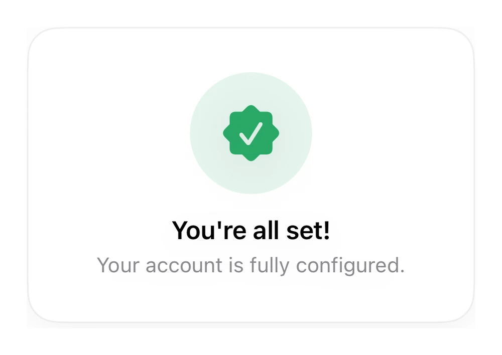
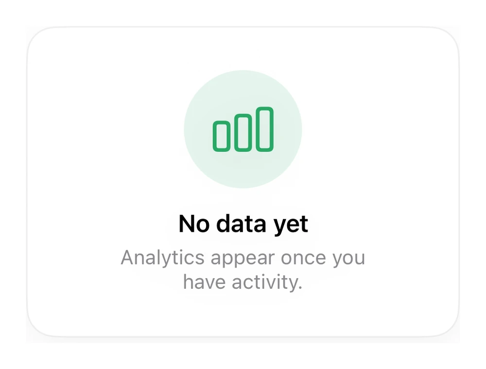
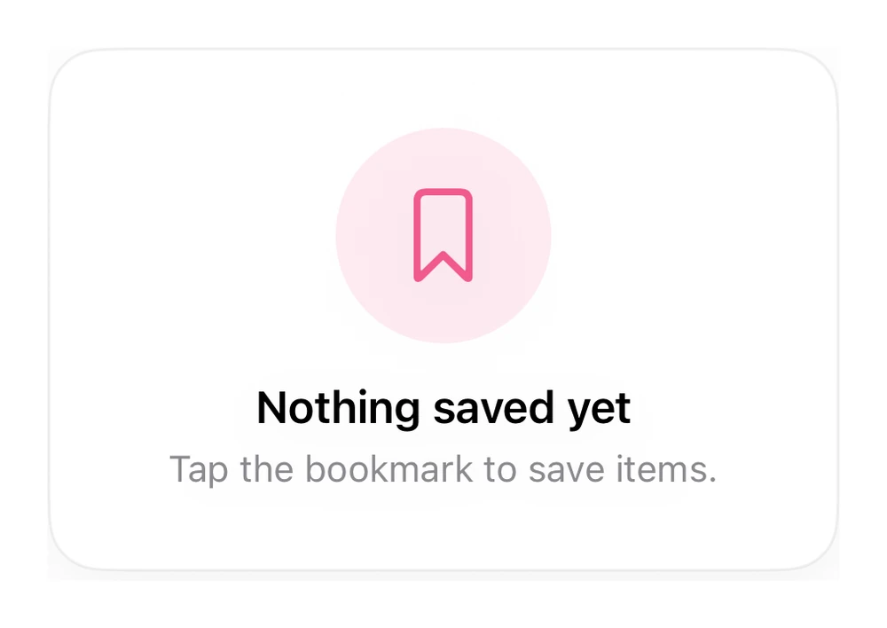
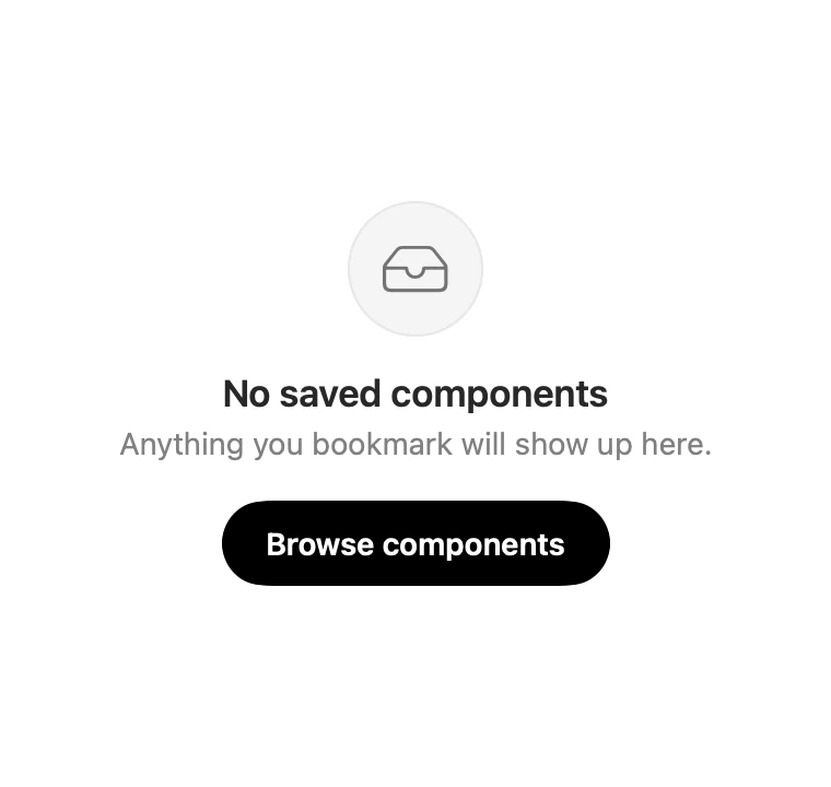
A soft glyph, one line of explanation, and a single way forward.
Feedback · SwiftUI · Flutter · iOS 17 · Flutter 3.16
- empty
- placeholder
- zero state
- onboarding
- feedback
The actual source
EmptyState.swift
// Empty State · syxUI · https://syxui.dev/components/empty-state
// Free in any project. Keep this line and credit syxUI where a person can read it.

import SwiftUI

/// An empty-state block: soft glyph, one line of explanation, one action.
///
/// Deliberately narrow — an empty state that fills the screen reads as an
/// error. `ContentUnavailableView` is the stock option; use this when you want
/// the shape and type to match a custom design.
struct EmptyState: View {
    var symbol: String = "tray"
    var title: String = "No saved components"
    var message: String = "Anything you bookmark will show up here."
    var actionTitle: String? = "Browse components"
    var onAction: () -> Void = {}

    var body: some View {
        VStack(spacing: 0) {
            Image(systemName: symbol)
                .font(.system(size: 26, weight: .light))
                .foregroundStyle(Color(white: 0.45))
                .frame(width: 62, height: 62)
                .background(Color(white: 0.955), in: Circle())
                .overlay(Circle().strokeBorder(Color(white: 0.91), lineWidth: 1))

            Text(title)
                .font(.system(size: 17, weight: .semibold))
                .padding(.top, 16)

            Text(message)
                .font(.system(size: 14))
                .foregroundStyle(.secondary)
                .multilineTextAlignment(.center)
                .fixedSize(horizontal: false, vertical: true)
                .padding(.top, 4)

            if let actionTitle {
                Button(action: onAction) {
                    Text(actionTitle)
                        .font(.system(size: 14, weight: .semibold))
                        .foregroundStyle(.white)
                        .padding(.horizontal, 20)
                        .padding(.vertical, 11)
                        .background(.black, in: Capsule())
                }
                .buttonStyle(.plain)
                .padding(.top, 18)
            }
        }
        .frame(maxWidth: 280)
        .accessibilityElement(children: .contain)
    }
}

#Preview {
    EmptyState()
        .padding(30)
}
iOS 17 · No dependencies
SwiftUI note. ContentUnavailableView covers the stock case on iOS 17. Use this when the glyph treatment or type has to match a custom design.
Dependencies
- SwiftUI
- No external dependencies
- Flutter
- No external dependencies
Requires iOS 17
Requires Flutter 3.16