Floating Tab Bar
From syxUI — written for both platforms, not translated between them.
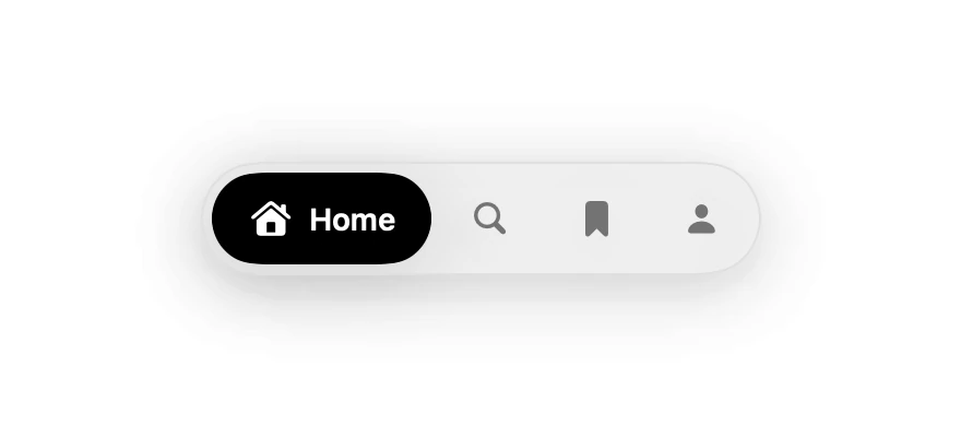
A pill tab bar whose selected item expands to reveal its label.
Navigation · SwiftUI · Flutter · iOS 17 · Flutter 3.27
- navigation
- tab bar
- tabs
- pill
- bottom bar
- floating
The actual source
FloatingTabBar.swift
// Floating Tab Bar · syxUI · https://syxui.dev/components/floating-tab-bar
// Free in any project. Keep this line and credit syxUI where a person can read it.

import SwiftUI

/// A pill tab bar that floats above content, with the selection indicator
/// sliding between items via `matchedGeometryEffect`.
struct FloatingTabBar: View {
    struct Item: Identifiable, Equatable {
        let id: String
        var symbol: String
        var title: String
    }

    var items: [Item] = [
        .init(id: "home", symbol: "house.fill", title: "Home"),
        .init(id: "search", symbol: "magnifyingglass", title: "Search"),
        .init(id: "saved", symbol: "bookmark.fill", title: "Saved"),
        .init(id: "profile", symbol: "person.fill", title: "You"),
    ]
    var selection: String = "home"
    var onSelect: (String) -> Void = { _ in }

    @State private var current: String = ""
    @Namespace private var namespace

    private var active: String { current.isEmpty ? selection : current }

    var body: some View {
        HStack(spacing: 4) {
            ForEach(items) { item in
                let isActive = item.id == active

                Button {
                    current = item.id
                    onSelect(item.id)
                } label: {
                    HStack(spacing: 6) {
                        Image(systemName: item.symbol)
                            .font(.system(size: 15, weight: .semibold))
                        if isActive {
                            Text(item.title)
                                .font(.system(size: 14, weight: .semibold))
                                .fixedSize()
                        }
                    }
                    .foregroundStyle(isActive ? .white : Color(white: 0.45))
                    .padding(.horizontal, isActive ? 16 : 14)
                    .frame(height: 42)
                    .background {
                        if isActive {
                            Capsule()
                                .fill(.black)
                                .matchedGeometryEffect(id: "indicator", in: namespace)
                        }
                    }
                    .contentShape(Capsule())
                }
                .buttonStyle(.plain)
                .accessibilityLabel(item.title)
                .accessibilityAddTraits(isActive ? [.isSelected, .isButton] : .isButton)
            }
        }
        .padding(5)
        .background(.regularMaterial, in: Capsule())
        .overlay(Capsule().strokeBorder(Color(white: 0.88), lineWidth: 1))
        .shadow(color: .black.opacity(0.10), radius: 18, y: 6)
        .animation(.spring(response: 0.36, dampingFraction: 0.78), value: active)
    }
}

#Preview {
    FloatingTabBar()
        .padding(30)
}
iOS 17 · No dependencies
SwiftUI note. matchedGeometryEffect moves the indicator between items. Overlay this on your content with .safeAreaInset(edge: .bottom) rather than putting it in a TabView.
Dependencies
- SwiftUI
- No external dependencies
- Flutter
- No external dependencies
Requires iOS 17
Requires Flutter 3.27