Loading Button
From syxUI — written for both platforms, not translated between them.
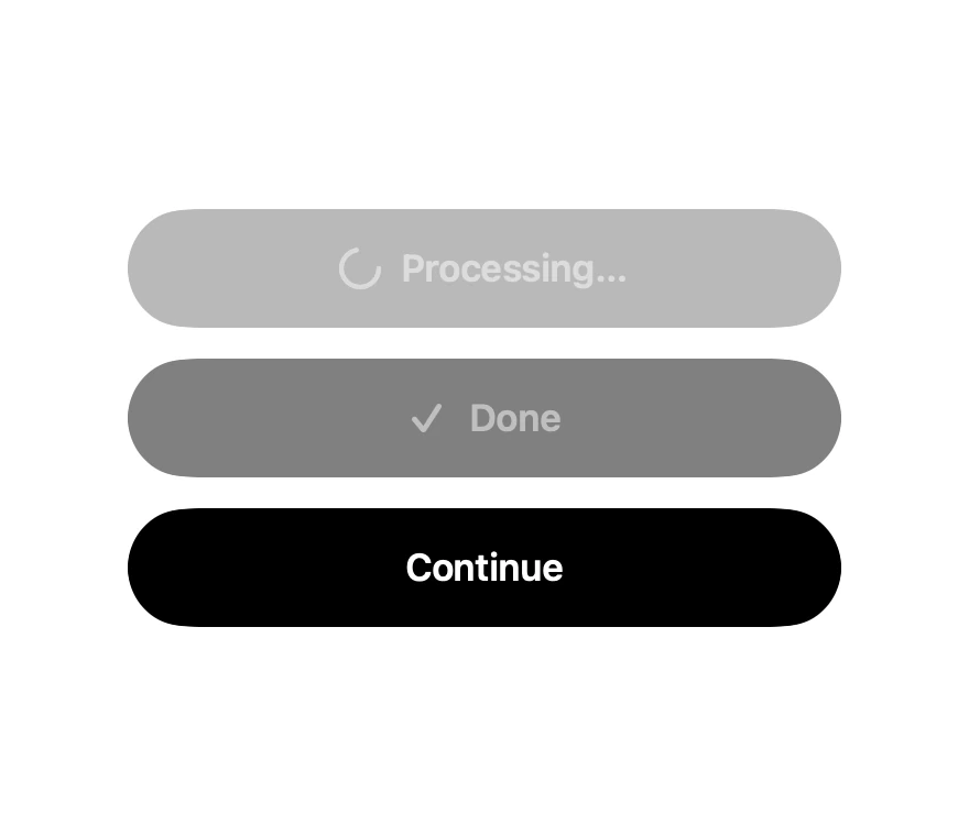
A submit button with in-place idle, processing, and success states.
Buttons · SwiftUI · Flutter · iOS 17 · Flutter 3.16
- button
- loading
- spinner
- submit
- async
The actual source
LoadingButton.swift
// Loading Button · syxUI · https://syxui.dev/components/loading-button
// Free in any project. Keep this line and credit syxUI where a person can read it.

import SwiftUI

/// A submit button that owns its progress and success states.
///
/// The frame is fixed across all three phases, so the label cross-fades in
/// place instead of the layout jumping when the text length changes.
struct LoadingButton: View {
    enum Phase: Equatable {
        case idle, loading, done
    }

    var title: String = "Continue"
    var loadingTitle: String = "Processing…"
    var doneTitle: String = "Done"
    var phase: Phase = .idle
    var action: () -> Void = {}

    @Environment(\.accessibilityReduceMotion) private var reduceMotion
    @State private var spin = false

    var body: some View {
        Button(action: action) {
            HStack(spacing: 10) {
                leadingIcon
                Text(label)
                    .font(.system(size: 17, weight: .semibold))
            }
            .frame(maxWidth: .infinity)
            .frame(height: 54)
            .foregroundStyle(foreground)
            .background(background, in: Capsule(style: .continuous))
            .contentShape(Capsule(style: .continuous))
        }
        .buttonStyle(.plain)
        .disabled(phase != .idle)
        .animation(.snappy(duration: 0.28), value: phase)
        .accessibilityLabel(label)
        .accessibilityAddTraits(phase == .loading ? .updatesFrequently : [])
    }

    private var label: String {
        switch phase {
        case .idle: title
        case .loading: loadingTitle
        case .done: doneTitle
        }
    }

    private var foreground: Color {
        phase == .idle ? .white : .white
    }

    private var background: Color {
        switch phase {
        case .idle: .black
        case .loading: Color(white: 0.45)
        case .done: .black
        }
    }

    @ViewBuilder
    private var leadingIcon: some View {
        switch phase {
        case .idle:
            EmptyView()
        case .loading:
            Circle()
                .trim(from: 0, to: 0.72)
                .stroke(.white.opacity(0.95),
                        style: StrokeStyle(lineWidth: 2.2, lineCap: .round))
                .frame(width: 17, height: 17)
                .rotationEffect(.degrees(spin ? 360 : 0))
                .onAppear {
                    guard !reduceMotion else { return }
                    withAnimation(.linear(duration: 0.9).repeatForever(autoreverses: false)) {
                        spin = true
                    }
                }
        case .done:
            Image(systemName: "checkmark")
                .font(.system(size: 15, weight: .bold))
                .transition(.scale.combined(with: .opacity))
        }
    }
}

#Preview {
    VStack(spacing: 14) {
        LoadingButton(phase: .loading)
        LoadingButton(phase: .done)
        LoadingButton()
    }
    .padding(30)
}
iOS 17 · No dependencies
SwiftUI note. Drive `phase` from your own async work. The button disables itself outside the idle phase, so a double tap cannot fire twice.
Dependencies
- SwiftUI
- No external dependencies
- Flutter
- No external dependencies
Requires iOS 17
Requires Flutter 3.16