Origami Fold
From syxUI — written for both platforms, not translated between them.
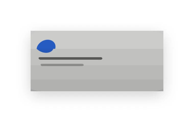
InteractiveA card that concertinas shut across four panels, each fold catching its own shade.
Accordions · SwiftUI · Flutter · iOS 17 · Flutter 3.27
- card
- fold
- origami
- accordion
- 3d
- collapse
- paper
- perspective
The actual source
MorphFold.swift
// Origami Fold · syxUI · https://syxui.dev/components/morph-fold
// Free in any project. Keep this line and credit syxUI where a person can read it.

import SwiftUI

/// A card that concertinas shut across evenly sliced horizontal panels.
///
/// Every panel reads a single `progress` and derives its own fold angle from
/// it — including the bottom-up stagger — so controlled mode (the preview
/// renderer scrubbing `progress`) and interactive mode (a tap animating
/// `progress` with a spring) produce pixel-identical frames. Nothing here is
/// a `.delay()` on an `Animation`; the delay is baked into the per-panel math.
struct MorphFold: View {
    var paperColor: Color = Color(red: 0.980, green: 0.980, blue: 0.969)
    var shadeColor: Color = Color(white: 0)
    var accent: Color = Color(red: 0.184, green: 0.435, blue: 0.929)
    var panels: Int = 4

    /// Rotation at full fold. Also what drives how far the card compresses,
    /// since a folded panel's laid-out height is `h · cos(angle)`.
    var maxFold: Double = 78
    var shadeAmount: Double = 0.35

    /// Preview override. When set, this renders that point of one fold
    /// instead of waiting for a tap.
    var progress: Double? = nil

    @Environment(\.accessibilityReduceMotion) private var reduceMotion
    @State private var interactive: Double = 0

    private var p: Double { progress ?? interactive }

    private static let cardWidth: CGFloat = 260
    private static let cardHeight: CGFloat = 168
    // Fraction of the total fold each panel is delayed behind the one below
    // it. Kept well under 1/(panels-1) at the 8-panel cap so every panel
    // still gets a real arc to move through.
    private static let stagger = 0.08

    var body: some View {
        let n = max(panels, 2)
        let panelHeight = Self.cardHeight / CGFloat(n)

        VStack(spacing: 0) {
            ForEach(0..<n, id: \.self) { index in
                let theta = foldAngle(for: index, of: n)
                let hingesAtTop = index.isMultiple(of: 2)
                // Rotate the true, full-height slice first — the anchor then
                // lands on its actual edge — and only afterward collapse the
                // layout frame to the now-foreshortened projected height.
                // Reversing that order (shrinking the frame, then rotating a
                // view that no longer reports its true size) puts the pivot
                // somewhere mid-panel and the fold visibly kinks.
                artworkSlice(index: index, panelHeight: panelHeight)
                    .rotation3DEffect(
                        .radians(sign(index) * theta),
                        axis: (x: 1, y: 0, z: 0),
                        anchor: hingesAtTop ? .top : .bottom,
                        anchorZ: 0,
                        perspective: 0.9
                    )
                    .frame(
                        height: panelHeight * CGFloat(cos(theta)),
                        alignment: hingesAtTop ? .top : .bottom
                    )
                    .clipped()
                    .overlay(shadeColor.opacity(shadeAmount * sin(theta)))
            }
        }
        .compositingGroup()
        .shadow(color: .black.opacity(0.18), radius: 14, y: 8)
        .frame(maxWidth: .infinity, maxHeight: .infinity)
        .contentShape(Rectangle())
        .onTapGesture(perform: toggle)
        .accessibilityElement()
        .accessibilityAddTraits(.isButton)
        .accessibilityLabel("Folding card")
        .accessibilityValue(p > 0.5 ? "Folded" : "Open")
        .accessibilityHint("Double tap to fold or unfold")
    }

    /// The full card face, offset upward by this panel's slot and clipped to
    /// one panel's height. Slicing one continuous artwork this way is what
    /// keeps the seams aligned — rendering each panel as its own small view
    /// would drift a pixel here and there and the fold would show it.
    private func artworkSlice(index: Int, panelHeight: CGFloat) -> some View {
        cardArtwork
            .frame(width: Self.cardWidth, height: Self.cardHeight, alignment: .top)
            .offset(y: -CGFloat(index) * panelHeight)
            .frame(width: Self.cardWidth, height: panelHeight, alignment: .top)
            .clipped()
    }

    private var cardArtwork: some View {
        ZStack(alignment: .topLeading) {
            RoundedRectangle(cornerRadius: 20, style: .continuous)
                .fill(paperColor)
            VStack(alignment: .leading, spacing: 10) {
                Circle()
                    .fill(accent)
                    .frame(width: 34, height: 34)
                RoundedRectangle(cornerRadius: 3)
                    .fill(shadeColor.opacity(0.55))
                    .frame(width: 120, height: 6)
                RoundedRectangle(cornerRadius: 3)
                    .fill(shadeColor.opacity(0.28))
                    .frame(width: 84, height: 6)
            }
            .padding(20)
        }
    }

    /// Bottom-up stagger: the last panel (bottom) leads at delay 0, the first
    /// panel (top) lags furthest behind, so the fold visibly travels upward.
    private func foldAngle(for index: Int, of count: Int) -> Double {
        let delay = Double(count - 1 - index) * Self.stagger
        let span = max(1 - Double(count - 1) * Self.stagger, 0.2)
        let localProgress = min(max((p - delay) / span, 0), 1)
        return maxFold * .pi / 180 * localProgress
    }

    private func sign(_ index: Int) -> Double {
        index.isMultiple(of: 2) ? 1 : -1
    }

    private func toggle() {
        guard progress == nil else { return }
        let target = p > 0.5 ? 0.0 : 1.0
        if reduceMotion {
            interactive = target
        } else {
            withAnimation(.timingCurve(0.32, 0.94, 0.24, 1, duration: 0.6)) {
                interactive = target
            }
        }
    }
}

#Preview {
    MorphFold()
        .frame(width: 380, height: 240)
        .padding(24)
}
iOS 17 · No dependencies
SwiftUI note. Rotate the full-height slice before shrinking its layout frame, in that order — reverse it and the pivot lands mid-panel instead of on the true hinge edge, which shows as a kink at every fold.
Dependencies
- SwiftUI
- No external dependencies
- Flutter
- No external dependencies
Requires iOS 17
Requires Flutter 3.27