Progress Button
From syxUI — written for both platforms, not translated between them.
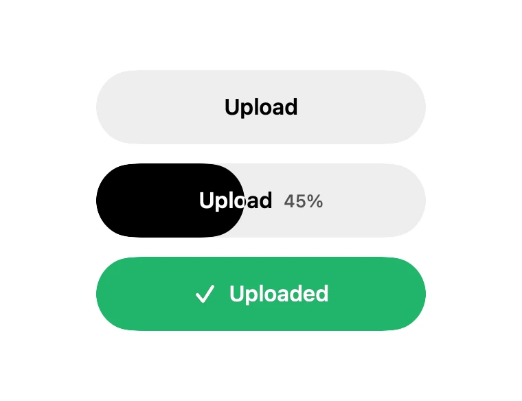
A button that fills with real progress and settles into a success state.
Buttons · SwiftUI · Flutter · iOS 17 · Flutter 3.27
- button
- progress
- upload
- loading
- async
- animated
The actual source
ProgressButton.swift
// Progress Button · syxUI · https://syxui.dev/components/progress-button
// Free in any project. Keep this line and credit syxUI where a person can read it.

import SwiftUI

/// A button that fills with progress and settles into a success state.
///
/// Useful where a spinner is not enough — uploads, exports, sync. The fill is
/// a clipped overlay rather than a resized view, so the label never moves and
/// the text stays legible over both halves.
struct ProgressButton: View {
    var title: String = "Upload"
    var doneTitle: String = "Uploaded"
    /// 0...1. At 1 the button flips to its success state.
    var progress: Double = 0
    var tint: Color = .black
    var doneTint: Color = Color(red: 0.13, green: 0.71, blue: 0.42)
    var action: () -> Void = {}

    private var isDone: Bool { progress >= 1 }

    var body: some View {
        Button(action: action) {
            GeometryReader { geo in
                let filled = geo.size.width * min(max(progress, 0), 1)

                ZStack(alignment: .leading) {
                    Capsule().fill(Color(white: 0.93))

                    Capsule()
                        .fill(isDone ? doneTint : tint)
                        .frame(width: filled)

                    // The label is drawn twice: ink over the empty track, and
                    // white clipped to the fill. That gives correct contrast on
                    // both halves without any blend-mode trickery.
                    label(.black)
                        .frame(width: geo.size.width)

                    label(.white)
                        .frame(width: geo.size.width)
                        .mask(alignment: .leading) {
                            Rectangle().frame(width: filled)
                        }
                }
            }
            .frame(width: 240, height: 54)
            .clipShape(Capsule())
            .contentShape(Capsule())
        }
        .buttonStyle(.plain)
        .animation(.snappy(duration: 0.35), value: progress)
        .accessibilityLabel(isDone ? doneTitle : title)
        .accessibilityValue("\(Int(min(progress, 1) * 100)) percent")
    }

    private func label(_ colour: Color) -> some View {
        HStack(spacing: 8) {
            if isDone {
                Image(systemName: "checkmark")
                    .font(.system(size: 15, weight: .bold))
            }
            Text(isDone ? doneTitle : title)
                .font(.system(size: 16, weight: .semibold))
            if !isDone && progress > 0 {
                Text("\(Int(progress * 100))%")
                    .font(.system(size: 13, weight: .medium))
                    .monospacedDigit()
                    .opacity(0.65)
            }
        }
        .foregroundStyle(colour)
        .frame(maxWidth: .infinity, maxHeight: .infinity)
    }
}

#Preview {
    VStack(spacing: 14) {
        ProgressButton(progress: 0)
        ProgressButton(progress: 0.45)
        ProgressButton(progress: 1)
    }
    .padding(30)
}
iOS 17 · No dependencies
SwiftUI note. Drive `progress` from your own upload or task. The label is drawn twice and masked rather than blended, so contrast is correct on both halves at any fill.
Dependencies
- SwiftUI
- No external dependencies
- Flutter
- No external dependencies
Requires iOS 17
Requires Flutter 3.27