Social Auth Buttons
From syxUI — written for both platforms, not translated between them.
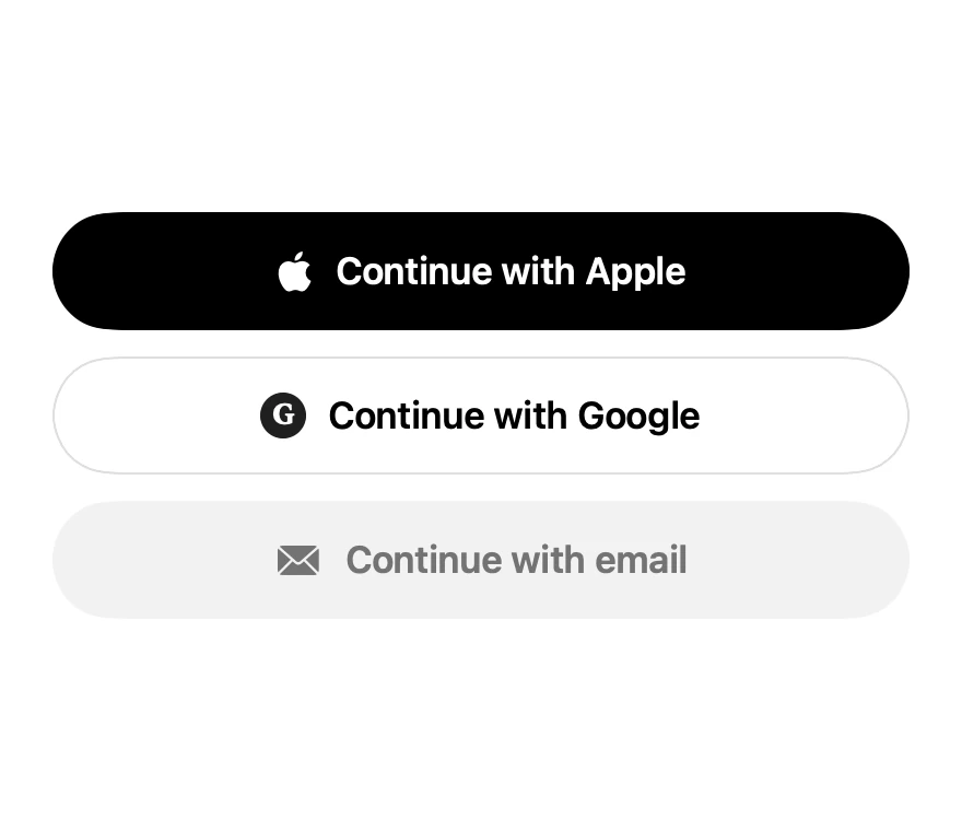
Apple, Google, and email sign-in rows sharing one row style.
Buttons · SwiftUI · Flutter · iOS 17 · Flutter 3.16
- button
- auth
- login
- sign in
- apple
- onboarding
The actual source
SocialAuthButtons.swift
// Social Auth Buttons · syxUI · https://syxui.dev/components/social-auth-buttons
// Free in any project. Keep this line and credit syxUI where a person can read it.

import SwiftUI

/// The three-provider sign-in stack most apps open with.
///
/// One row type, three tints. Apple's mark is an SF Symbol, so it stays sharp
/// at every Dynamic Type size and needs no bundled asset.
struct SocialAuthButtons: View {
    var onApple: () -> Void = {}
    var onGoogle: () -> Void = {}
    var onEmail: () -> Void = {}

    var body: some View {
        VStack(spacing: 12) {
            AuthRow(title: "Continue with Apple", style: .filled, action: onApple) {
                Image(systemName: "apple.logo")
                    .font(.system(size: 19))
            }
            AuthRow(title: "Continue with Google", style: .outlined, action: onGoogle) {
                GoogleMark()
            }
            AuthRow(title: "Continue with email", style: .muted, action: onEmail) {
                Image(systemName: "envelope.fill")
                    .font(.system(size: 16))
            }
        }
    }
}

private struct AuthRow<Icon: View>: View {
    enum Style {
        case filled, outlined, muted
    }

    let title: String
    let style: Style
    let action: () -> Void
    @ViewBuilder var icon: Icon

    var body: some View {
        Button(action: action) {
            HStack(spacing: 10) {
                icon
                Text(title)
                    .font(.system(size: 17, weight: .semibold))
            }
            .foregroundStyle(foreground)
            .frame(maxWidth: .infinity)
            .frame(height: 54)
            .background(background, in: Capsule(style: .continuous))
            .overlay {
                if style == .outlined {
                    Capsule(style: .continuous)
                        .strokeBorder(Color(white: 0.87), lineWidth: 1)
                }
            }
            .contentShape(Capsule(style: .continuous))
        }
        .buttonStyle(.plain)
        .accessibilityLabel(title)
    }

    private var foreground: Color {
        switch style {
        case .filled: .white
        case .outlined: .black
        case .muted: Color(white: 0.45)
        }
    }

    private var background: Color {
        switch style {
        case .filled: .black
        case .outlined: .white
        case .muted: Color(white: 0.95)
        }
    }
}

/// Google's wordmark is trademarked, so this is a neutral monogram.
/// Swap in the official asset if your app ships Google Sign-In.
private struct GoogleMark: View {
    var body: some View {
        Text("G")
            .font(.system(size: 13, weight: .bold, design: .serif))
            .foregroundStyle(.white)
            .frame(width: 21, height: 21)
            .background(Color(white: 0.12), in: Circle())
    }
}

#Preview {
    SocialAuthButtons()
        .padding(30)
}
iOS 17 · No dependencies
SwiftUI note. Apple's mark is the `apple.logo` SF Symbol. Apple's Human Interface Guidelines require Sign in with Apple to be offered when you offer other third-party sign-in, and to sit at the top of the stack.
Dependencies
- SwiftUI
- No external dependencies
- Flutter
- No external dependencies
Requires iOS 17
Requires Flutter 3.16