Glass Sheen
From syxUI — written for both platforms, not translated between them.
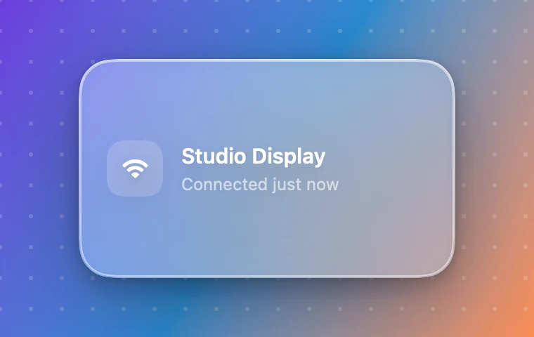
A frosted panel with a stacked-shadow depth and a specular band that sweeps across the surface.
Cards · SwiftUI · Flutter · iOS 17 · Flutter 3.27
- card
- glass
- specular
- material
- blur
- shadow
- depth
- frosted
The actual source
DepthGlassSheen.swift
// Glass Sheen · syxUI · https://syxui.dev/components/depth-glass-sheen
// Free in any project. Keep this line and credit syxUI where a person can read it.

import SwiftUI

/// A frosted panel with real, stacked-shadow depth and a specular band that
/// sweeps across the surface — distinct from a static rim-only glass card on
/// three counts: a three-layer shadow stack instead of one blur, a travelling
/// sheen instead of a fixed highlight, and a 1pt inner top line under the rim
/// the way a real glass edge catches light twice.
struct DepthGlassSheen: View {
    var tint: Color = Color(white: 1.0)
    var rimColor: Color = Color(white: 1.0)
    var sheenColor: Color = Color(white: 1.0)
    var shadowColor: Color = Color(red: 0.043, green: 0.051, blue: 0.078)
    /// SwiftUI's `Material` has no public blur radius, so this shapes the
    /// ambient bloom bleeding through the glass instead — see `notes`.
    var blurRadius: CGFloat = 24
    /// Seconds for one full sweep-and-dwell cycle.
    var period: Double = 5.5
    /// Preview override. When set, the component renders that point of one
    /// loop instead of driving its own clock.
    var phase: Double? = nil

    @Environment(\.accessibilityReduceMotion) private var reduceMotion
    @State private var animated: Double = 0

    private let corner: CGFloat = 24

    private var current: Double { phase ?? animated }

    private var shape: RoundedRectangle {
        RoundedRectangle(cornerRadius: corner, style: .continuous)
    }

    var body: some View {
        content
            .padding(20)
            .frame(width: 268, height: 156, alignment: .leading)
            .background(.ultraThinMaterial, in: shape)
            .background { shape.fill(tint.opacity(0.08)) }
            .background {
                // Ambient bloom sitting behind everything else, so the glass
                // and its material both soften it further — this is what
                // `blurRadius` actually drives (see the property comment).
                Circle()
                    .fill(tint.opacity(0.55))
                    .frame(width: 220, height: 150)
                    .blur(radius: blurRadius)
            }
            .overlay { sheenOverlay }
            .overlay {
                shape.strokeBorder(
                    LinearGradient(
                        colors: [rimColor.opacity(0.65), rimColor.opacity(0.12)],
                        startPoint: .top,
                        endPoint: .bottom
                    ),
                    lineWidth: 1
                )
            }
            .overlay {
                // The inner line under the rim — one point further in, faint
                // white — is what real glass edges do: two catches of light,
                // not one.
                shape.inset(by: 1.5).stroke(Color.white.opacity(0.5), lineWidth: 1)
            }
            .clipShape(shape)
            // Three shadows compose in the order written, contact to ambient —
            // one blur reads as a drop shadow, three read as depth.
            .shadow(color: shadowColor.opacity(0.06), radius: 2, x: 0, y: 1)
            .shadow(color: shadowColor.opacity(0.10), radius: 8, x: 0, y: 6)
            .shadow(color: shadowColor.opacity(0.16), radius: 32, x: 0, y: 18)
            .onAppear(perform: start)
            .accessibilityElement(children: .combine)
            .accessibilityLabel("Glass panel, device connected notification")
    }

    private var content: some View {
        HStack(spacing: 13) {
            RoundedRectangle(cornerRadius: 12, style: .continuous)
                .fill(.white.opacity(0.18))
                .frame(width: 40, height: 40)
                .overlay {
                    Image(systemName: "wifi")
                        .font(.system(size: 16, weight: .semibold))
                        .foregroundStyle(.white)
                }

            VStack(alignment: .leading, spacing: 3) {
                Text("Studio Display")
                    .font(.system(size: 15, weight: .semibold))
                    .foregroundStyle(.white)
                Text("Connected just now")
                    .font(.system(size: 12))
                    .foregroundStyle(.white.opacity(0.6))
            }
            Spacer(minLength: 0)
        }
    }

    /// A 90pt band travelling from off-card left to off-card right with a
    /// long dwell at the far end, masked to the card shape so nothing escapes
    /// the rounded corners.
    private var sheenOverlay: some View {
        GeometryReader { proxy in
            let w = proxy.size.width
            let h = proxy.size.height
            let x = -0.45 * w + (1.9 * w) * sweepPosition(current)
            Rectangle()
                .fill(
                    LinearGradient(
                        colors: [.clear, sheenColor.opacity(0.55), .clear],
                        startPoint: .leading,
                        endPoint: .trailing
                    )
                )
                .frame(width: 90, height: h * 2.4)
                .rotationEffect(.degrees(22))
                .position(x: x, y: h / 2)
        }
        .mask(shape)
        .blendMode(.plusLighter)
        .allowsHitTesting(false)
    }

    /// Travel over the first 60% of the loop, eased; dwell at the far (fully
    /// off-card) end for the remaining 40%. Both endpoints sit outside the
    /// card, so the wrap from 1 back to 0 is invisible.
    private func sweepPosition(_ p: Double) -> Double {
        let travelFraction = 0.6
        guard p < travelFraction else { return 1 }
        let x = p / travelFraction
        return 0.5 - 0.5 * cos(.pi * x)
    }

    private func start() {
        guard phase == nil, !reduceMotion, period > 0 else { return }
        withAnimation(.linear(duration: period).repeatForever(autoreverses: false)) {
            animated = 1
        }
    }
}

#Preview {
    DepthGlassSheen()
        .frame(width: 380, height: 240)
        .background(
            LinearGradient(colors: [.purple, .blue, .teal], startPoint: .topLeading, endPoint: .bottomTrailing)
        )
}
iOS 17 · No dependencies
SwiftUI note. SwiftUI's Material has no public blur radius, so blurRadius here shapes the ambient bloom bleeding through the glass rather than the true sampling blur — raise it for a thicker, softer pane. It loops continuously to stay demoable; for a real layout, a sheen that fires once via .onAppear and stops is often the tasteful default. On iOS 26, .glassEffect(.regular, in: shape) is worth swapping in for the material.
Dependencies
- SwiftUI
- No external dependencies
- Flutter
- No external dependencies
Requires iOS 17
Requires Flutter 3.27