Glass Card
From syxUI — written for both platforms, not translated between them.
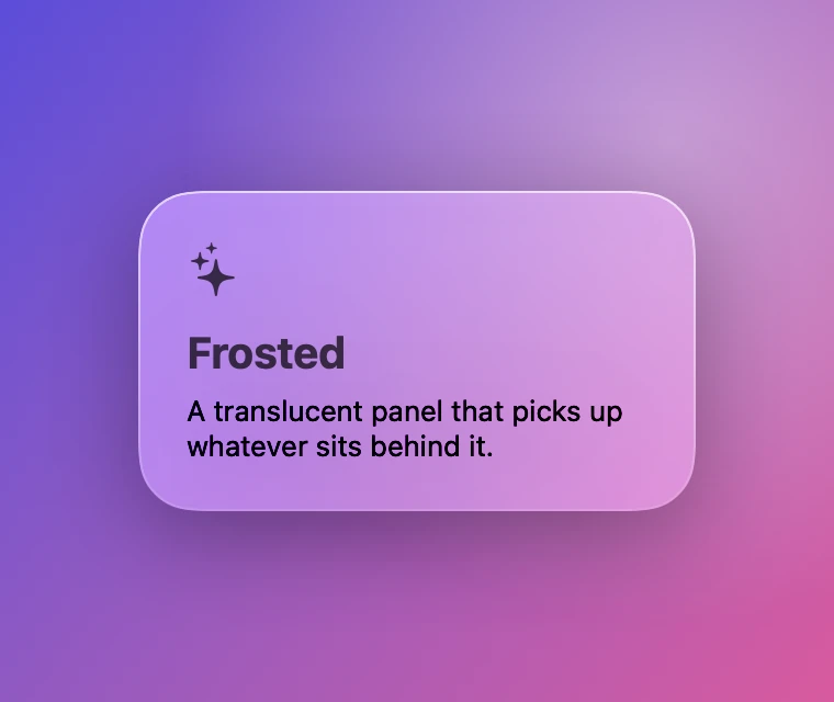
A frosted container with a top-lit rim that reads as glass over any backdrop.
Cards · SwiftUI · Flutter · iOS 17 · Flutter 3.27
- card
- glass
- blur
- material
- frosted
- container
The actual source
GlassCard.swift
// Glass Card · syxUI · https://syxui.dev/components/glass-card
// Free in any project. Keep this line and credit syxUI where a person can read it.

import SwiftUI

/// A frosted panel that reads as glass over any backdrop.
///
/// Generic over its content, so it works as a container rather than a
/// single-purpose card. The hairline border is what sells the effect — a blur
/// alone looks like a grey rectangle.
struct GlassCard<Content: View>: View {
    var cornerRadius: CGFloat = 26
    @ViewBuilder var content: Content

    private var shape: RoundedRectangle {
        RoundedRectangle(cornerRadius: cornerRadius, style: .continuous)
    }

    var body: some View {
        content
            .padding(22)
            .background(.ultraThinMaterial, in: shape)
            .overlay {
                // Top-lit rim: bright along the top edge, fading by the middle.
                shape.strokeBorder(
                    LinearGradient(
                        colors: [.white.opacity(0.65), .white.opacity(0.12)],
                        startPoint: .top,
                        endPoint: .bottom
                    ),
                    lineWidth: 1
                )
            }
            .shadow(color: .black.opacity(0.18), radius: 24, y: 10)
    }
}

/// Default content used by the catalog preview.
extension GlassCard where Content == GlassCardSample {
    init(cornerRadius: CGFloat = 26) {
        self.init(cornerRadius: cornerRadius) { GlassCardSample() }
    }
}

struct GlassCardSample: View {
    var body: some View {
        VStack(alignment: .leading, spacing: 6) {
            Image(systemName: "sparkles")
                .font(.system(size: 22))
                .padding(.bottom, 6)
            Text("Frosted")
                .font(.system(size: 20, weight: .bold))
            Text("A translucent panel that picks up whatever sits behind it.")
                .font(.system(size: 13))
                .foregroundStyle(.secondary)
                .fixedSize(horizontal: false, vertical: true)
        }
        .frame(width: 210, alignment: .leading)
    }
}

#Preview {
    ZStack {
        LinearGradient(colors: [.purple, .blue], startPoint: .topLeading, endPoint: .bottomTrailing)
        GlassCard()
    }
    .frame(width: 360, height: 300)
}
iOS 17 · No dependencies
SwiftUI note. On iOS 26 replace .ultraThinMaterial with .glassEffect(.regular, in: shape) to adopt Liquid Glass. Materials only render over content — on a flat colour it looks like a grey box.
Dependencies
- SwiftUI
- No external dependencies
- Flutter
- No external dependencies
Requires iOS 17
Requires Flutter 3.27