Percentage Circle
From syxUI — written for both platforms, not translated between them.
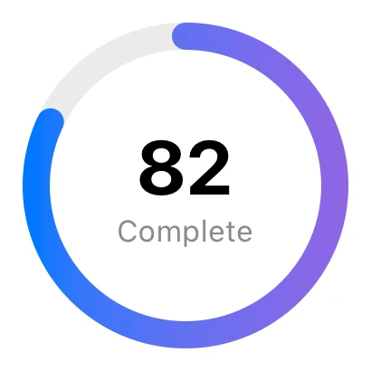
A large gradient percentage ring.
Loaders · SwiftUI · iOS 17
- loaders
- swiftui
The actual source
PercentageCircle.swift
// Percentage Circle · syxUI · https://syxui.dev/components/loader-percentage
// Free in any project. Keep this line and credit syxUI where a person can read it.

import SwiftUI

let ldBlue = Color(red: 0.0, green: 0.47, blue: 1.0)

struct PercentageCircle: View { var body: some View { ZStack { Circle().stroke(Color.primary.opacity(0.08), lineWidth: 10).frame(width: 110, height: 110); Circle().trim(from: 0, to: 0.82).stroke(LinearGradient(colors: [ldBlue, Color(red: 0.55, green: 0.40, blue: 0.90)], startPoint: .top, endPoint: .bottom), style: StrokeStyle(lineWidth: 10, lineCap: .round)).frame(width: 110, height: 110).rotationEffect(.degrees(-90)); VStack(spacing: 0) { Text("82").font(.system(size: 28, weight: .bold)); Text("Complete").font(.system(size: 11)).foregroundStyle(.secondary) } } } }
iOS 17 · No dependencies
Dependencies
- SwiftUI
- No external dependencies
Requires iOS 17