Container Transform
From syxUI — written for both platforms, not translated between them.
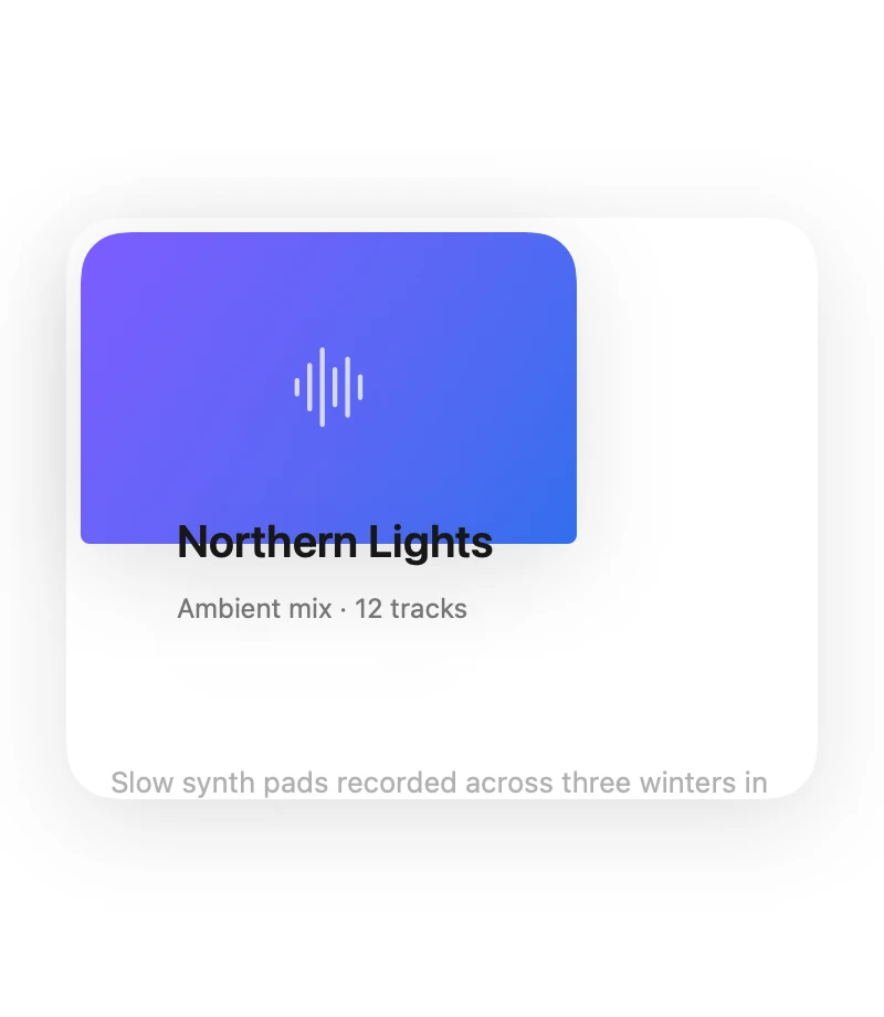
InteractiveA compact row that expands in place into a full detail panel, one continuous surface.
Cards · SwiftUI · Flutter · iOS 17 · Flutter 3.27
- card
- morph
- expand
- container-transform
- detail
- material
- transition
The actual source
MorphContainer.swift
// Container Transform · syxUI · https://syxui.dev/components/morph-container
// Free in any project. Keep this line and credit syxUI where a person can read it.

import SwiftUI

/// A compact row that expands in place into a full detail panel.
///
/// One view, not two. Every dimension — height, corner radius, artwork rect,
/// text origin and scale — is lerped from a single `progress`, so the collapsed
/// row, the open panel and every frame between them come out of the same
/// layout pass. That is what makes the morph scrubbable, and it is why there
/// is no `matchedGeometryEffect` here: a matched pair cannot be driven by a
/// `Double`, so it cannot be scrolled, previewed, or tested.
struct MorphContainer: View {
    var surface: Color = Color(white: 1.0)
    var accent: Color = Color(red: 0.184, green: 0.435, blue: 0.929)
    var artA: Color = Color(red: 0.486, green: 0.361, blue: 1.0)
    var artB: Color = Color(red: 0.184, green: 0.435, blue: 0.929)
    /// Corner radius of the open panel. The collapsed row always sits at 16.
    var cornerRadiusOpen: CGFloat = 28
    /// Spring damping for the expansion. Below about 0.75 the panel overshoots
    /// its open height, which reads as bounce rather than as weight.
    var dampingFraction: Double = 0.82

    /// Preview and scroll override. 0 is the collapsed row, 1 the open panel.
    /// When set, the component renders that point of the morph instead of
    /// driving its own state.
    var progress: Double? = nil

    @Environment(\.accessibilityReduceMotion) private var reduceMotion
    @State private var interactive: Double = 0

    private var p: Double { progress ?? interactive }

    private let cardWidth: CGFloat = 340
    private let closedHeight: CGFloat = 96
    private let openHeight: CGFloat = 384

    var body: some View {
        ZStack(alignment: .topLeading) {
            artwork
            header
            chevron
            detail
        }
        .frame(width: cardWidth, height: lerp(closedHeight, openHeight, p), alignment: .topLeading)
        .background(surface)
        .clipShape(RoundedRectangle(cornerRadius: lerp(16, cornerRadiusOpen, p), style: .continuous))
        // Three shadow parameters move together. A radius that grows without
        // the offset growing with it makes a large card look like it is lying
        // flat on the page.
        .shadow(
            color: Color(white: 0).opacity(lerp(0.06, 0.16, p)),
            radius: lerp(8, 34, p),
            x: 0,
            y: lerp(2, 16, p)
        )
        .contentShape(Rectangle())
        .onTapGesture(perform: toggle)
        .accessibilityElement(children: .ignore)
        .accessibilityAddTraits(.isButton)
        .accessibilityLabel("Northern Lights, ambient mix, 12 tracks")
        .accessibilityValue(p > 0.5 ? "Expanded" : "Collapsed")
        .accessibilityHint(p > 0.5 ? "Double tap to collapse" : "Double tap to expand")
    }

    // MARK: - Layers

    /// The artwork is the anchor of the whole transform: it starts as a 64pt
    /// thumbnail inset from the leading edge and ends flush with the top of the
    /// card. Its bottom corners straighten to 0 while the top pair grow into
    /// the card radius, so at p = 1 it reads as part of the surface rather than
    /// as a rounded tile sitting on it.
    private var artwork: some View {
        let topRadius = lerp(10, cornerRadiusOpen, p)
        let bottomRadius = lerp(10, 0, p)

        return UnevenRoundedRectangle(
            topLeadingRadius: topRadius,
            bottomLeadingRadius: bottomRadius,
            bottomTrailingRadius: bottomRadius,
            topTrailingRadius: topRadius,
            style: .continuous
        )
        .fill(
            LinearGradient(
                colors: [artA, artB],
                startPoint: .topLeading,
                endPoint: .bottomTrailing
            )
        )
        .frame(width: lerp(64, cardWidth, p), height: lerp(64, 196, p))
        .overlay {
            // Drawn once at the large size and scaled down, because
            // `.font(.system(size:))` snaps between integral sizes instead of
            // tweening through them.
            Image(systemName: "waveform")
                .font(.system(size: 46, weight: .light))
                .foregroundStyle(Color(white: 1).opacity(lerp(0.92, 0.62, p)))
                .scaleEffect(lerp(22.0 / 46.0, 1, p))
        }
        .offset(x: lerp(16, 0, p), y: lerp(16, 0, p))
    }

    /// Title and subtitle are positioned absolutely rather than stacked, so
    /// each one owns its origin at both ends of the morph. A `VStack` would
    /// lay out at the unscaled size and the spacing would drift as the scale
    /// changed.
    private var header: some View {
        ZStack(alignment: .topLeading) {
            Text("Northern Lights")
                .font(.system(size: 24, weight: .semibold))
                .foregroundStyle(Color(white: 0.09))
                .fixedSize()
                .scaleEffect(lerp(15.0 / 24.0, 1, p), anchor: .topLeading)
                .offset(x: lerp(92, 20, p), y: lerp(26, 212, p))

            Text("Ambient mix · 12 tracks")
                .font(.system(size: 13, weight: .regular))
                .foregroundStyle(Color(white: 0.46))
                .fixedSize()
                .scaleEffect(lerp(11.0 / 13.0, 1, p), anchor: .topLeading)
                .offset(x: lerp(92, 20, p), y: lerp(56, 250, p))
        }
    }

    /// Out early. A disclosure arrow that lingers into the open state is the
    /// clearest tell that two views were crossfaded.
    private var chevron: some View {
        Image(systemName: "chevron.right")
            .font(.system(size: 13, weight: .semibold))
            .foregroundStyle(Color(white: 0.64))
            .opacity(1 - ramp(p, 0, 0.25))
            .offset(x: 312, y: 41)
    }

    /// Body copy and actions arrive deliberately late — the last 40% of the
    /// morph — and rise 12pt as they do. Fading text across the whole
    /// expansion is what makes cheap container transforms look like a
    /// dissolve; here the surface has almost finished growing before there is
    /// anything to read inside it.
    private var detail: some View {
        let bodyIn = easeOut(ramp(p, 0.50, 0.88))
        let actionIn = easeOut(ramp(p, 0.62, 0.98))

        return ZStack(alignment: .topLeading) {
            Text("Slow synth pads recorded across three winters in Tromsø. Best played quietly, and late.")
                .font(.system(size: 13))
                .foregroundStyle(Color(white: 0.40))
                .lineSpacing(4)
                .frame(width: 300, alignment: .leading)
                .fixedSize(horizontal: false, vertical: true)
                .opacity(bodyIn)
                .offset(x: 20, y: lerp(198, 272, p) + lerp(12, 0, bodyIn))

            actions
                .opacity(actionIn)
                .offset(x: 20, y: lerp(258, 332, p) + lerp(12, 0, actionIn))
        }
    }

    private var actions: some View {
        HStack(spacing: 10) {
            Text("Play")
                .font(.system(size: 15, weight: .semibold))
                .foregroundStyle(Color(white: 1))
                .frame(width: 145, height: 40)
                .background(accent, in: RoundedRectangle(cornerRadius: 12, style: .continuous))

            Text("Save")
                .font(.system(size: 15, weight: .medium))
                .foregroundStyle(accent)
                .frame(width: 145, height: 40)
                .background(
                    accent.opacity(0.10),
                    in: RoundedRectangle(cornerRadius: 12, style: .continuous)
                )
        }
    }

    // MARK: - Interaction

    private func toggle() {
        guard progress == nil else { return }
        let opening = interactive < 0.5

        guard !reduceMotion else {
            interactive = opening ? 1 : 0
            return
        }

        // Opening carries a little overshoot; closing does not. Bounce on the
        // way out reads as a glitch rather than as physics. A second tap
        // mid-flight retargets the same spring instead of queueing, which is
        // why this is one `withAnimation` and not a sequence.
        let curve: Animation = opening
            ? .spring(response: 0.42, dampingFraction: dampingFraction)
            : .spring(response: 0.36, dampingFraction: min(1, dampingFraction + 0.08))

        withAnimation(curve) { interactive = opening ? 1 : 0 }
    }

    // MARK: - Maths

    private func lerp(_ a: Double, _ b: Double, _ t: Double) -> Double {
        a + (b - a) * t
    }

    /// `value` remapped from the window `from...to` onto 0...1, clamped. Every
    /// staged fade in this component is one of these, which keeps the geometry
    /// linear in `p` and the sequencing readable in one place.
    private func ramp(_ value: Double, _ from: Double, _ to: Double) -> Double {
        guard to > from else { return value >= to ? 1 : 0 }
        return min(1, max(0, (value - from) / (to - from)))
    }

    private func easeOut(_ t: Double) -> Double {
        1 - pow(1 - t, 3)
    }
}

#Preview {
    MorphContainer()
        .frame(width: 400, height: 440)
}
iOS 17 · No dependencies
SwiftUI note. Because the geometry is lerped from one `progress` rather than matched between two views, a scroll offset or a drag can scrub the morph as easily as a tap can run it; for a real push onto a NavigationStack use `.navigationTransition(.zoom(sourceID:in:))` on iOS 18 instead. The title is drawn at the open size and scaled down — `.font(.system(size:))` snaps between sizes rather than tweening.
Dependencies
- SwiftUI
- No external dependencies
- Flutter
- No external dependencies
Requires iOS 17
Requires Flutter 3.27