Form Expand
From syxUI — written for both platforms, not translated between them.
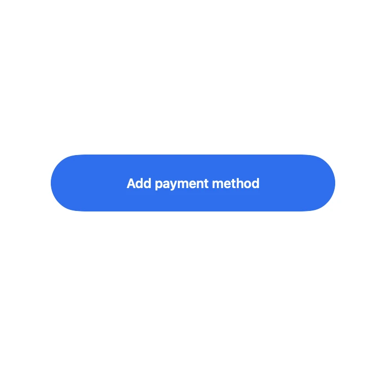
InteractiveA pill button that grows into a form, then collapses to a success pill with a drawn tick.
Cards · SwiftUI · Flutter · iOS 17 · Flutter 3.27
- card
- form
- expand
- morph
- inline
- button
- success
- three-state
The actual source
MorphFormExpand.swift
// Form Expand · syxUI · https://syxui.dev/components/morph-form-expand
// Free in any project. Keep this line and credit syxUI where a person can read it.

import SwiftUI

/// A pill button that grows into a form, then collapses to a success pill
/// with a drawn checkmark.
///
/// Everything rides one `p` in 0...2: 0...1 opens the panel, 1...2 submits
/// it. Splitting the range this way means "submit" is not a second
/// transition wired to a boolean — it's the same progress axis continuing
/// past 1, so a scrubbed preview can stop anywhere in either half and still
/// read correctly. The label never fades out and back in; it is one `Text`
/// that slides and grows into the header, which is what sells the morph.
struct MorphFormExpand: View {
    var accent: Color = Color(red: 0.184, green: 0.435, blue: 0.929)
    var surface: Color = Color(white: 1.0)
    var fieldColor: Color = Color(red: 0.949, green: 0.953, blue: 0.969)
    var successColor: Color = Color(red: 0.086, green: 0.639, blue: 0.290)
    var openHeight: CGFloat = 300
    /// Per-field reveal delay, as a fraction of the opening half of `p` —
    /// not seconds, so it stays right whether `p` is spring-driven or
    /// scrubbed by the preview.
    var stagger: Double = 0.05
    /// Preview override. 0 is the closed button, 1 the open form, 2 the
    /// success pill.
    var progress: Double? = nil

    @Environment(\.accessibilityReduceMotion) private var reduceMotion
    @State private var interactive: Double = 0
    @State private var stage: Stage = .closed
    @State private var cardholderName = ""
    @State private var cardNumber = ""

    private enum Stage { case closed, open, success }

    private var p: Double { progress ?? interactive }

    private let width: CGFloat = 280
    private let pillHeight: CGFloat = 56
    private let closedRadius: CGFloat = 28
    private let openRadius: CGFloat = 20

    /// 0 before the panel starts opening, 1 once it is fully open.
    private var openAmount: Double { ramp(p, 0, 1) }
    /// 0 until submit begins, 1 once the panel has re-collapsed to a pill.
    private var collapseAmount: Double { ramp(p, 1, 1.5) }
    /// 0 until the pill has settled, 1 once the checkmark is fully drawn.
    private var tickAmount: Double { ramp(p, 1.5, 2) }

    private var height: CGFloat {
        lerp(lerp(pillHeight, openHeight, openAmount), pillHeight, collapseAmount)
    }
    private var radius: CGFloat {
        lerp(lerp(closedRadius, openRadius, openAmount), closedRadius, collapseAmount)
    }

    private var labelScale: Double { lerp(13, 17, openAmount) / 17 }
    private var labelRise: CGFloat { lerp(0, -(openHeight / 2 - 40), openAmount) }
    private var labelOpacity: Double { 1 - collapseAmount }
    private var formOpacity: Double { openAmount * (1 - collapseAmount) }
    private var successOpacity: Double { collapseAmount }

    var body: some View {
        let shape = RoundedRectangle(cornerRadius: radius, style: .continuous)

        ZStack {
            // The base fill starts as the button colour; surface and the
            // success tint cross-fade on top of it rather than the colour
            // itself being interpolated, so every intermediate frame is a
            // real flat colour instead of a muddy RGB blend.
            shape.fill(accent)
            shape.fill(surface).opacity(openAmount)
            shape.fill(successColor).opacity(successOpacity)

            label
            form.opacity(formOpacity)
            success.opacity(successOpacity)
        }
        .frame(width: width, height: height)
        .clipShape(shape)
        .clipped()
        .contentShape(shape)
        .onTapGesture(perform: open)
        .sensoryFeedback(.impact(flexibility: .soft), trigger: stage)
        .accessibilityElement()
        .accessibilityAddTraits(.isButton)
        .accessibilityLabel(accessibilityText)
    }

    private var accessibilityText: String {
        switch stage {
        case .closed: return "Add payment method"
        case .open: return "Add payment method form, save card to submit"
        case .success: return "Payment method added"
        }
    }

    private var label: some View {
        let text = Text("Add payment method")
            .font(.system(size: 17, weight: .semibold))
            .lineLimit(1)
        return ZStack {
            text.foregroundStyle(.white).opacity(1 - openAmount)
            text.foregroundStyle(Color(white: 0.1)).opacity(openAmount)
        }
        .scaleEffect(labelScale)
        .offset(y: labelRise)
        .opacity(labelOpacity)
        .accessibilityHidden(true)
    }

    private var form: some View {
        VStack(spacing: 14) {
            Spacer().frame(height: 34)
            field("Cardholder name", text: $cardholderName, index: 0)
            field("Card number", text: $cardNumber, index: 1)
            submitButton
        }
        .padding(.horizontal, 22)
        .padding(.bottom, 20)
        .frame(width: width, height: openHeight, alignment: .top)
        .accessibilityHidden(stage != .open)
    }

    private func field(_ placeholder: String, text: Binding<String>, index: Int) -> some View {
        TextField(placeholder, text: text)
            .textFieldStyle(.plain)
            .font(.system(size: 14))
            .padding(.horizontal, 14)
            .frame(height: 46)
            .background(fieldColor, in: RoundedRectangle(cornerRadius: 12, style: .continuous))
            .opacity(fieldOpacity(index))
            .offset(y: fieldOffset(index))
    }

    private var submitButton: some View {
        Text("Save card")
            .font(.system(size: 15, weight: .semibold))
            .foregroundStyle(.white)
            .frame(maxWidth: .infinity)
            .frame(height: 46)
            .background(accent, in: RoundedRectangle(cornerRadius: 12, style: .continuous))
            .opacity(fieldOpacity(2))
            .offset(y: fieldOffset(2))
            .onTapGesture(perform: submit)
    }

    /// The three staggered items: field one, field two, the submit button.
    private func fieldOpacity(_ index: Int) -> Double {
        let start = 0.12 + stagger * Double(index)
        return ramp(openAmount, start, start + 0.22)
    }
    private func fieldOffset(_ index: Int) -> CGFloat {
        12 * (1 - fieldOpacity(index))
    }

    private var checkmark: Path {
        Path { path in
            path.move(to: CGPoint(x: 0, y: 6.5))
            path.addLine(to: CGPoint(x: 6, y: 12))
            path.addLine(to: CGPoint(x: 16, y: 0))
        }
    }

    private var success: some View {
        HStack(spacing: 10) {
            checkmark
                .trim(from: 0, to: tickAmount)
                .stroke(Color.white, style: StrokeStyle(lineWidth: 2.5, lineCap: .round, lineJoin: .round))
                .frame(width: 16, height: 12)
            Text("Added")
                .font(.system(size: 15, weight: .semibold))
                .foregroundStyle(.white)
                .opacity(tickAmount)
        }
        .accessibilityHidden(true)
    }

    private func open() {
        guard progress == nil, stage == .closed else { return }
        stage = .open
        withAnimation(reduceMotion ? .linear(duration: 0) : .spring(response: 0.40, dampingFraction: 0.90)) {
            interactive = 1
        }
    }

    /// Submit runs as two chained segments on the same value — the panel
    /// re-collapses first, and only once it has settled does the checkmark
    /// begin drawing, matching "starting once the height has settled".
    private func submit() {
        guard progress == nil, stage == .open else { return }
        stage = .success

        let collapseCurve: Animation = reduceMotion ? .linear(duration: 0) : .easeOut(duration: 0.30)
        let tickCurve: Animation = reduceMotion ? .linear(duration: 0) : .easeOut(duration: 0.35)

        withAnimation(collapseCurve) { interactive = 1.5 }
        withAnimation(tickCurve.delay(reduceMotion ? 0 : 0.30)) { interactive = 2 }

        let resetDelay = reduceMotion ? 1.2 : 2.2
        DispatchQueue.main.asyncAfter(deadline: .now() + resetDelay) {
            guard stage == .success else { return }
            stage = .closed
            cardholderName = ""
            cardNumber = ""
            withAnimation(reduceMotion ? .linear(duration: 0) : .spring(response: 0.42, dampingFraction: 0.92)) {
                interactive = 0
            }
        }
    }
}

private func clamp(_ value: Double) -> Double { min(max(value, 0), 1) }

private func ramp(_ value: Double, _ from: Double, _ to: Double) -> Double {
    clamp((value - from) / (to - from))
}

private func lerp(_ a: CGFloat, _ b: CGFloat, _ t: Double) -> CGFloat {
    a + (b - a) * CGFloat(t)
}

private func lerp(_ a: Double, _ b: Double, _ t: Double) -> Double {
    a + (b - a) * t
}

#Preview {
    VStack(spacing: 40) {
        MorphFormExpand()
        MorphFormExpand(progress: 1.0)
        MorphFormExpand(progress: 2.0)
    }
    .padding(40)
}
iOS 17 · No dependencies
SwiftUI note. progress runs 0…1 to open and 1…2 to submit, so a scrubbed preview can stop anywhere in either half and still read correctly. The background never interpolates colour directly — surface and successColor are separate fills cross-fading on top of accent — which keeps every frame a flat, real colour.
Dependencies
- SwiftUI
- No external dependencies
- Flutter
- No external dependencies
Requires iOS 17
Requires Flutter 3.27