Circle Reveal
From syxUI — written for both platforms, not translated between them.
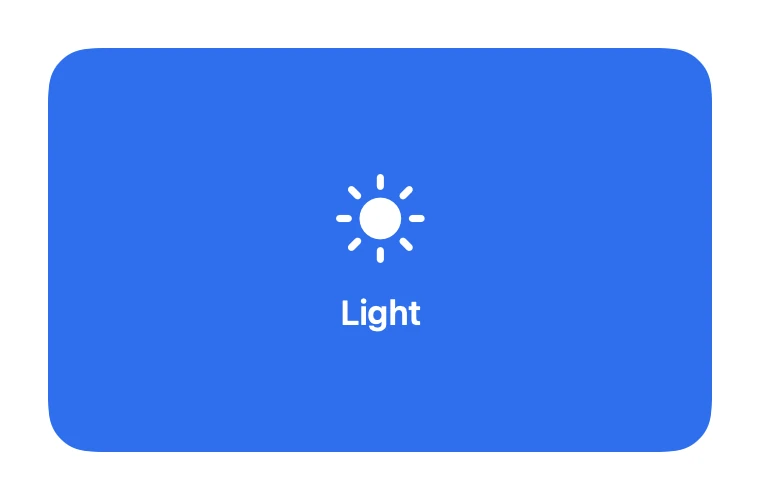
InteractiveA tap grows a circular mask from your finger, swapping the card's face underneath.
Cards · SwiftUI · Flutter · iOS 17 · Flutter 3.27
- card
- reveal
- mask
- circle
- clip
- tap
- theme-switch
- transition
The actual source
MorphRevealCircle.swift
// Circle Reveal · syxUI · https://syxui.dev/components/morph-reveal-circle
// Free in any project. Keep this line and credit syxUI where a person can read it.

import SwiftUI

/// A tap grows a circular mask from your finger, swapping the card's face
/// underneath — the classic light/dark theme-switch transition.
///
/// The mask radius is the only thing driven by `p`; the tap point is
/// captured once per tap, not animated, so tapping again contracts toward
/// the *new* point rather than the old one. A 1.5pt ring riding the mask
/// edge is what reads as "a circle is growing" once the fill underneath is
/// uniform and the motion alone would not say so.
struct MorphRevealCircle: View {
    var faceA: Color = Color(red: 0.184, green: 0.435, blue: 0.929)
    var faceB: Color = Color(red: 0.063, green: 0.075, blue: 0.09)
    var ringColor: Color = Color(white: 1.0)
    var textColor: Color = Color(white: 1.0)
    /// Seconds. How long a tap takes to grow or contract the mask.
    var duration: Double = 0.45
    var ringWidth: CGFloat = 1.5
    /// Preview override. 0 shows face A only, 1 face B fully revealed.
    var progress: Double? = nil

    @Environment(\.accessibilityReduceMotion) private var reduceMotion
    @State private var interactive: Double = 0
    @State private var revealed = false
    @State private var tapPoint: CGPoint?

    private var p: Double { progress ?? interactive }

    var body: some View {
        GeometryReader { geo in
            let size = geo.size
            // Centre reads as an iris closing rather than a wipe — the
            // brief for this effect specifically calls out a lower-right
            // anchor as the better-looking default.
            let anchor = tapPoint ?? CGPoint(x: size.width * 0.72, y: size.height * 0.78)
            let maxDistance = cornerDistance(from: anchor, in: size)
            let radius = maxDistance * p
            let ringAlpha = 1 - ramp(p, 0.7, 1.0)
            let contentScale = lerp(1.06, 1.0, p)

            ZStack {
                face(faceA, icon: "sun.max.fill", label: "Light", tint: .white)

                face(faceB, icon: "moon.stars.fill", label: "Dark", tint: textColor)
                    .scaleEffect(contentScale)
                    .mask {
                        Circle()
                            .frame(width: radius * 2, height: radius * 2)
                            .position(anchor)
                    }
            }
            .clipShape(RoundedRectangle(cornerRadius: 22, style: .continuous))
            // Required — without it the mask above leaks past the clip
            // shape instead of compositing against it.
            .compositingGroup()
            .overlay {
                Circle()
                    .strokeBorder(ringColor.opacity(ringAlpha), lineWidth: ringWidth)
                    .frame(width: radius * 2, height: radius * 2)
                    .position(anchor)
            }
            .contentShape(Rectangle())
            .gesture(tapGesture)
            .accessibilityElement()
            .accessibilityAddTraits(.isButton)
            .accessibilityLabel(revealed ? "Dark theme" : "Light theme")
        }
    }

    private func face(_ color: Color, icon: String, label: String, tint: Color) -> some View {
        ZStack {
            color
            VStack(spacing: 12) {
                Image(systemName: icon).font(.system(size: 42))
                Text(label).font(.system(size: 17, weight: .semibold))
            }
            .foregroundStyle(tint)
        }
        .accessibilityHidden(true)
    }

    private var tapGesture: some Gesture {
        SpatialTapGesture()
            .onEnded { value in
                guard progress == nil else { return }
                tapPoint = value.location
                revealed.toggle()
                withAnimation(reduceMotion ? .linear(duration: 0) : .easeOut(duration: duration)) {
                    interactive = revealed ? 1 : 0
                }
            }
    }

    private func cornerDistance(from point: CGPoint, in size: CGSize) -> CGFloat {
        let corners = [
            CGPoint(x: 0, y: 0), CGPoint(x: size.width, y: 0),
            CGPoint(x: 0, y: size.height), CGPoint(x: size.width, y: size.height),
        ]
        return corners.map { hypot($0.x - point.x, $0.y - point.y) }.max() ?? 0
    }
}

private func clamp(_ value: Double) -> Double { min(max(value, 0), 1) }

private func ramp(_ value: Double, _ from: Double, _ to: Double) -> Double {
    clamp((value - from) / (to - from))
}

private func lerp(_ a: CGFloat, _ b: CGFloat, _ t: Double) -> CGFloat {
    a + (b - a) * CGFloat(t)
}

#Preview {
    HStack(spacing: 30) {
        MorphRevealCircle()
        MorphRevealCircle(progress: 0.5)
        MorphRevealCircle(progress: 1.0)
    }
    .frame(height: 240)
    .padding(40)
}
iOS 17 · No dependencies
SwiftUI note. `.compositingGroup()` before the ring `.overlay` is required — without it the Circle mask on face B leaks past the outer clipShape instead of compositing against it. The tap point is captured once per tap and held in @State; it is never itself animated, only the radius is.
Dependencies
- SwiftUI
- No external dependencies
- Flutter
- No external dependencies
Requires iOS 17
Requires Flutter 3.27