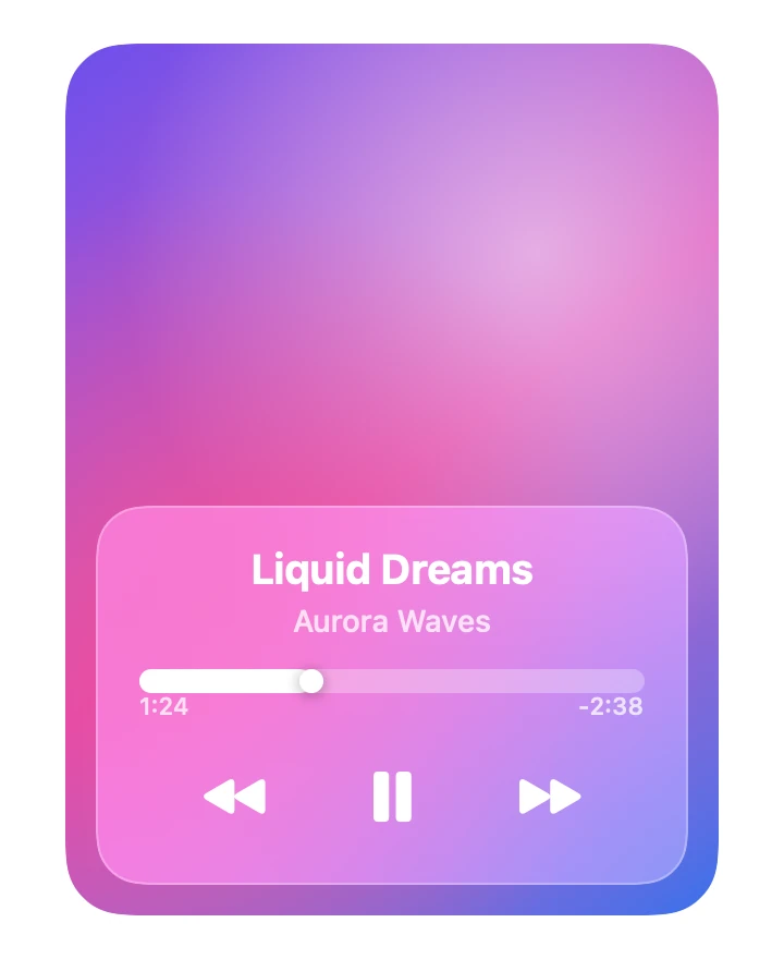
Now Playing
From syxUI — written for both platforms, not translated between them.
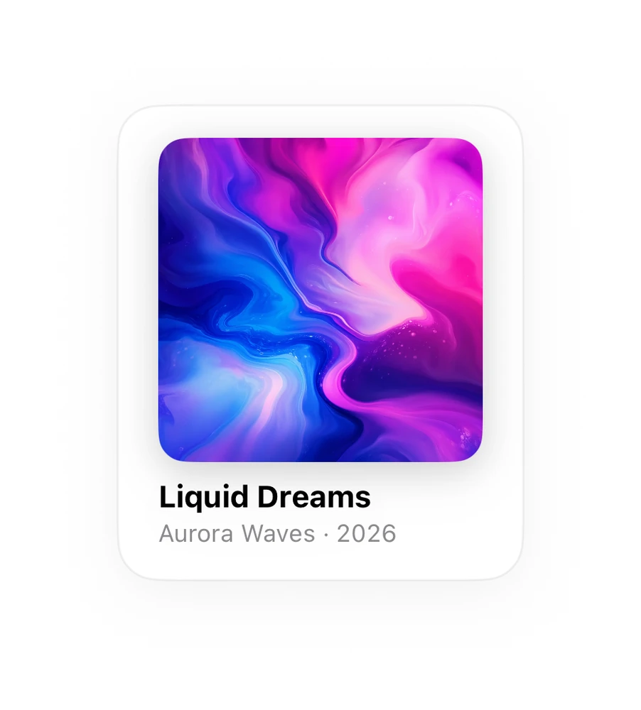
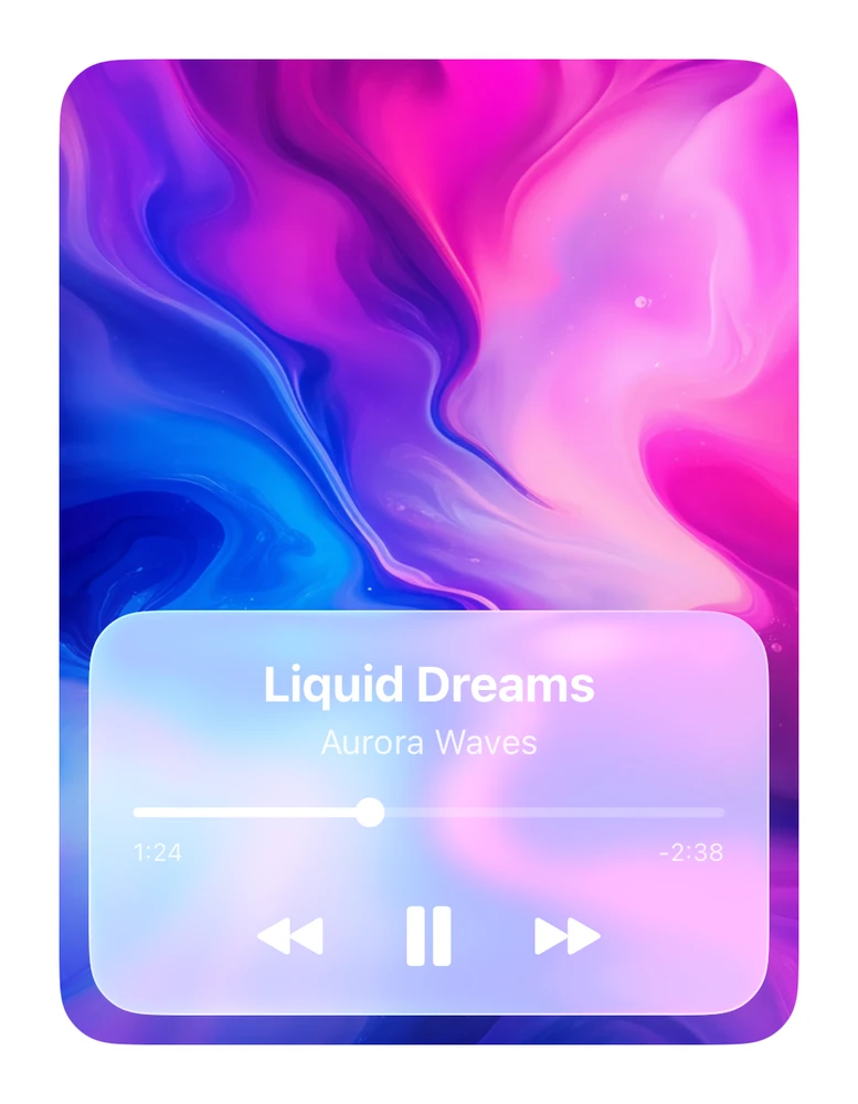
A playback card with artwork, a scrubber, and transport controls on frosted glass.
Music · SwiftUI · Flutter · iOS 17 · Flutter 3.27
- music
- player
- media
- card
- glass
- audio
- transport
The actual source
NowPlaying.swift
// Now Playing · syxUI · https://syxui.dev/components/now-playing
// Free in any project. Keep this line and credit syxUI where a person can read it.

import SwiftUI

/// A now-playing card: artwork, scrubber, and transport controls on a
/// translucent panel.
///
/// `artwork` is optional. Pass `Image("albumArt")` for real cover art; with
/// nothing passed the card draws its own gradient, so it never renders empty
/// while a download is in flight.
struct NowPlaying: View {
    var title: String = "Liquid Dreams"
    var artist: String = "Aurora Waves"
    var artwork: Image? = nil
    var progress: Double = 0.34
    var elapsed: String = "1:24"
    var remaining: String = "-2:38"
    var isPlaying: Bool = true

    var onPlayPause: () -> Void = {}
    var onPrevious: () -> Void = {}
    var onNext: () -> Void = {}

    var body: some View {
        ZStack(alignment: .bottom) {
            cover
            panel
                .padding(14)
        }
        .frame(width: 300, height: 400)
        .clipShape(RoundedRectangle(cornerRadius: 28, style: .continuous))
    }

    @ViewBuilder
    private var cover: some View {
        if let artwork {
            artwork
                .resizable()
                .aspectRatio(contentMode: .fill)
        } else {
            LinearGradient(
                colors: [
                    Color(red: 0.42, green: 0.31, blue: 0.93),
                    Color(red: 0.85, green: 0.26, blue: 0.72),
                    Color(red: 0.20, green: 0.44, blue: 0.92),
                ],
                startPoint: .topLeading,
                endPoint: .bottomTrailing
            )
            .overlay {
                // Two soft blooms break up the linear ramp so the gradient
                // reads as artwork rather than as a background.
                RadialGradient(
                    colors: [.white.opacity(0.55), .clear],
                    center: .init(x: 0.72, y: 0.24),
                    startRadius: 0,
                    endRadius: 190
                )
                RadialGradient(
                    colors: [Color(red: 0.98, green: 0.35, blue: 0.55).opacity(0.7), .clear],
                    center: .init(x: 0.22, y: 0.66),
                    startRadius: 0,
                    endRadius: 200
                )
            }
        }
    }

    private var panel: some View {
        VStack(spacing: 14) {
            VStack(spacing: 3) {
                Text(title)
                    .font(.system(size: 19, weight: .bold))
                Text(artist)
                    .font(.system(size: 14, weight: .medium))
                    .foregroundStyle(.white.opacity(0.75))
            }

            scrubber

            HStack(spacing: 34) {
                TransportButton(symbol: "backward.fill", size: 20, action: onPrevious)
                    .accessibilityLabel("Previous track")
                TransportButton(symbol: isPlaying ? "pause.fill" : "play.fill",
                                size: 27, action: onPlayPause)
                    .accessibilityLabel(isPlaying ? "Pause" : "Play")
                TransportButton(symbol: "forward.fill", size: 20, action: onNext)
                    .accessibilityLabel("Next track")
            }
            .padding(.bottom, 2)
        }
        .foregroundStyle(.white)
        .padding(.vertical, 18)
        .padding(.horizontal, 20)
        .background(.ultraThinMaterial.opacity(0.85),
                    in: RoundedRectangle(cornerRadius: 22, style: .continuous))
        .overlay {
            RoundedRectangle(cornerRadius: 22, style: .continuous)
                .strokeBorder(.white.opacity(0.28), lineWidth: 1)
        }
    }

    private var scrubber: some View {
        VStack(spacing: 6) {
            GeometryReader { geo in
                ZStack(alignment: .leading) {
                    Capsule().fill(.white.opacity(0.3))
                    Capsule()
                        .fill(.white)
                        .frame(width: max(4, geo.size.width * progress))
                    Circle()
                        .fill(.white)
                        .frame(width: 11, height: 11)
                        .offset(x: geo.size.width * progress - 5.5)
                        .shadow(color: .black.opacity(0.25), radius: 3, y: 1)
                }
            }
            .frame(height: 4)

            HStack {
                Text(elapsed)
                Spacer()
                Text(remaining)
            }
            .font(.system(size: 11, weight: .medium))
            .foregroundStyle(.white.opacity(0.75))
        }
        .accessibilityElement(children: .ignore)
        .accessibilityLabel("Playback position")
        .accessibilityValue("\(Int(progress * 100)) percent")
    }
}

private struct TransportButton: View {
    let symbol: String
    let size: CGFloat
    let action: () -> Void

    var body: some View {
        Button(action: action) {
            Image(systemName: symbol)
                .font(.system(size: size, weight: .semibold))
                .frame(width: size + 14, height: size + 14)
                .contentShape(Circle())
        }
        .buttonStyle(.plain)
    }
}

#Preview {
    NowPlaying()
        .padding(30)
}
iOS 17 · No dependencies
SwiftUI note. The panel uses .ultraThinMaterial. On iOS 26 you can swap that line for .glassEffect(.regular, in:) to pick up Liquid Glass.
Assets this component uses
Download the file, keep the name, and drop it where the notes say. Or swap in your own.
 Download
album-art.png
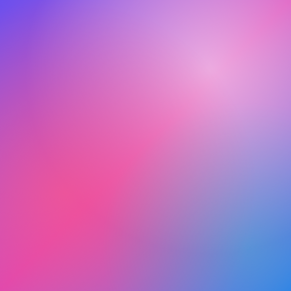
Optional 600×600 cover art. The card draws its own gradient when no artwork is supplied, so this is a starting point rather than a requirement.
- SwiftUI
- Drag into your Xcode Asset Catalog and name it albumArt, then pass artwork: Image("albumArt").
- Flutter
- Save to assets/album-art.png, declare it under flutter/assets: in pubspec.yaml, then pass artwork: const AssetImage('assets/album-art.png').
Dependencies
- SwiftUI
- No external dependencies
- Flutter
- No external dependencies
Requires iOS 17
Requires Flutter 3.27