Onboarding Pager
From syxUI — written for both platforms, not translated between them.
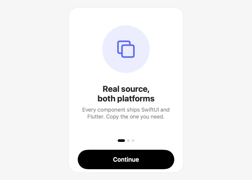
A three-page first-run intro with artwork, stretching dots, and one action.
Onboarding · SwiftUI · Flutter · iOS 17 · Flutter 3.27
- onboarding
- intro
- pager
- walkthrough
- first run
- pages
The actual source
OnboardingPager.swift
// Onboarding Pager · syxUI · https://syxui.dev/components/onboarding-pager
// Free in any project. Keep this line and credit syxUI where a person can read it.

import SwiftUI

/// A three-page first-run intro: artwork, headline, body, dots, one action.
///
/// Paging is a horizontal `ScrollView` with `.scrollTargetBehavior(.viewAligned)`
/// rather than a `TabView`. That keeps the swipe, the snap, and the end
/// rubber-band as system behaviour, but unlike the page-style TabView it is
/// not iOS-only and it lets the button drive position through
/// `.scrollPosition(id:)`. The dots are custom because the system ones cannot
/// be restyled.
struct OnboardingPager: View {
    struct Page: Identifiable {
        let id = UUID()
        var symbol: String
        var title: String
        var body: String
        var tint: Color
    }

    var pages: [Page] = [
        .init(symbol: "square.on.square",
              title: "Real source, both platforms",
              body: "Every component ships SwiftUI and Flutter. Copy the one you need.",
              tint: Color(red: 0.36, green: 0.42, blue: 0.98)),
        .init(symbol: "bolt.fill",
              title: "No package to install",
              body: "One file, no imports of ours. Paste it in and it is your code.",
              tint: Color(red: 0.95, green: 0.45, blue: 0.30)),
        .init(symbol: "checkmark.seal.fill",
              title: "What you see is what compiles",
              body: "Previews are rendered from the exact source on the page.",
              tint: Color(red: 0.15, green: 0.70, blue: 0.46)),
    ]

    var onFinish: () -> Void = {}
    /// Drive the page position externally, 0...1 across all pages. In this
    /// controlled mode the pager shows one page at a time and does not scroll,
    /// which is what makes it deterministic in tests and screenshots.
    var progress: Double? = nil

    @State private var scrolled: Int?

    private var current: Int {
        if let progress {
            return min(Int(progress * Double(pages.count)), pages.count - 1)
        }
        return scrolled ?? 0
    }

    var body: some View {
        VStack(spacing: 0) {
            if progress == nil {
                pager
            } else {
                pageView(pages[current])
                    .frame(maxWidth: .infinity, maxHeight: .infinity)
            }

            dots
                .padding(.top, 4)

            Button(action: advance) {
                Text(current == pages.count - 1 ? "Get started" : "Continue")
                    .font(.system(size: 17, weight: .semibold))
                    .foregroundStyle(.white)
                    .frame(maxWidth: .infinity)
                    .frame(height: 54)
                    .background(.black, in: Capsule())
            }
            .buttonStyle(.plain)
            .padding(.horizontal, 26)
            .padding(.top, 22)
            .padding(.bottom, 10)
        }
        .frame(width: 320, height: 460)
        .animation(.snappy(duration: 0.3), value: current)
    }

    private var pager: some View {
        ScrollView(.horizontal) {
            HStack(spacing: 0) {
                ForEach(Array(pages.enumerated()), id: \.element.id) { offset, page in
                    pageView(page)
                        .containerRelativeFrame(.horizontal)
                        .id(offset)
                }
            }
            .scrollTargetLayout()
        }
        .scrollTargetBehavior(.viewAligned)
        .scrollPosition(id: $scrolled, anchor: .center)
        .scrollIndicators(.hidden)
    }

    private func pageView(_ page: Page) -> some View {
        VStack(spacing: 0) {
            ZStack {
                Circle()
                    .fill(page.tint.opacity(0.12))
                    .frame(width: 132, height: 132)
                Image(systemName: page.symbol)
                    .font(.system(size: 46, weight: .medium))
                    .foregroundStyle(page.tint)
            }
            .padding(.bottom, 30)

            Text(page.title)
                .font(.system(size: 23, weight: .bold))
                .multilineTextAlignment(.center)

            Text(page.body)
                .font(.system(size: 15))
                .foregroundStyle(.secondary)
                .multilineTextAlignment(.center)
                .fixedSize(horizontal: false, vertical: true)
                .padding(.top, 8)
        }
        .padding(.horizontal, 30)
        .accessibilityElement(children: .combine)
    }

    private var dots: some View {
        HStack(spacing: 6) {
            ForEach(0..<pages.count, id: \.self) { offset in
                Capsule()
                    .fill(offset == current ? Color.black : Color(white: 0.85))
                    // The active dot stretches rather than just darkening, so
                    // position is legible without relying on colour.
                    .frame(width: offset == current ? 20 : 7, height: 7)
            }
        }
        .accessibilityElement()
        .accessibilityLabel("Page \(current + 1) of \(pages.count)")
    }

    private func advance() {
        if current == pages.count - 1 {
            onFinish()
        } else {
            withAnimation(.snappy(duration: 0.32)) { scrolled = current + 1 }
        }
    }
}

#Preview {
    OnboardingPager()
        .padding(20)
}
iOS 17 · No dependencies
SwiftUI note. TabView with .page style keeps the swipe, the end rubber-band, and VoiceOver page navigation as system behaviour. Only the dots are custom.
Dependencies
- SwiftUI
- No external dependencies
- Flutter
- No external dependencies
Requires iOS 17
Requires Flutter 3.27