Product Card
From syxUI — written for both platforms, not translated between them.
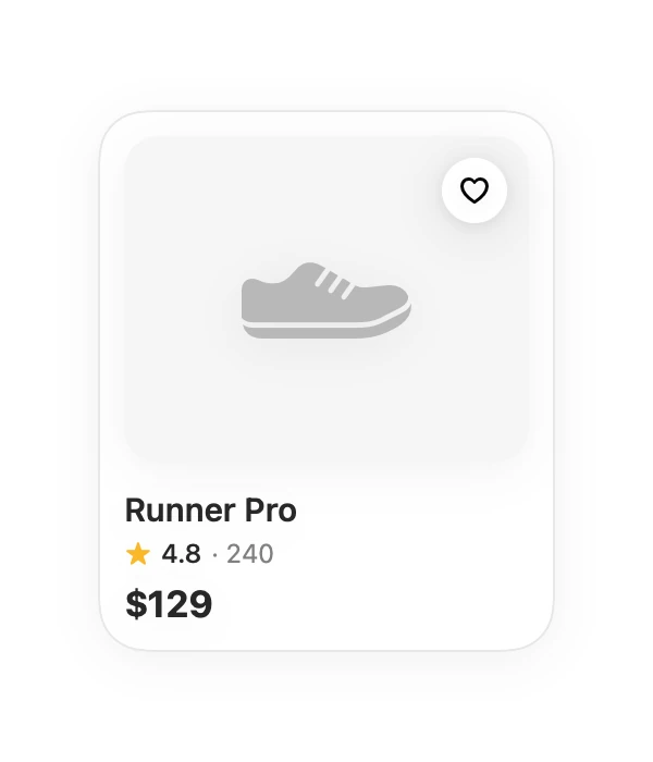
A storefront tile with an image well, favourite toggle, rating, and price.
Cards · SwiftUI · Flutter · iOS 17 · Flutter 3.27
- card
- product
- commerce
- shop
- ecommerce
- grid
The actual source
ProductCard.swift
// Product Card · syxUI · https://syxui.dev/components/product-card
// Free in any project. Keep this line and credit syxUI where a person can read it.

import SwiftUI

/// A storefront tile: image well, favourite toggle, title, rating, price.
///
/// The image well keeps a fixed aspect ratio so a grid of these stays aligned
/// even when photography is inconsistent.
struct ProductCard: View {
    var name: String = "Runner Pro"
    var price: String = "$129"
    var rating: Double = 4.8
    var reviewCount: Int = 240
    var image: Image? = nil

    @State private var isFavourite = false

    var body: some View {
        VStack(alignment: .leading, spacing: 0) {
            imageWell
                .frame(height: 150)
                .frame(maxWidth: .infinity)
                .background(Color(white: 0.96))
                .clipShape(RoundedRectangle(cornerRadius: 16, style: .continuous))
                .overlay(alignment: .topTrailing) {
                    favouriteButton.padding(10)
                }

            Text(name)
                .font(.system(size: 15, weight: .semibold))
                .padding(.top, 12)

            HStack(spacing: 4) {
                Image(systemName: "star.fill")
                    .font(.system(size: 10))
                    .foregroundStyle(Color(red: 0.98, green: 0.72, blue: 0.16))
                Text(String(format: "%.1f", rating))
                    .font(.system(size: 12, weight: .medium))
                Text("· \(reviewCount)")
                    .font(.system(size: 12))
                    .foregroundStyle(.secondary)
            }
            .padding(.top, 3)

            Text(price)
                .font(.system(size: 17, weight: .bold))
                .padding(.top, 6)
        }
        .padding(12)
        .frame(width: 210)
        .background(.white, in: RoundedRectangle(cornerRadius: 22, style: .continuous))
        .overlay {
            RoundedRectangle(cornerRadius: 22, style: .continuous)
                .strokeBorder(Color(white: 0.91), lineWidth: 1)
        }
        .shadow(color: .black.opacity(0.05), radius: 12, y: 4)
    }

    @ViewBuilder
    private var imageWell: some View {
        if let image {
            image.resizable().aspectRatio(contentMode: .fill)
        } else {
            // Neutral placeholder so the tile keeps its shape before the
            // photograph loads.
            Image(systemName: "shoe.fill")
                .font(.system(size: 54, weight: .light))
                .foregroundStyle(Color(white: 0.72))
        }
    }

    private var favouriteButton: some View {
        Button {
            isFavourite.toggle()
        } label: {
            Image(systemName: isFavourite ? "heart.fill" : "heart")
                .font(.system(size: 13, weight: .semibold))
                .foregroundStyle(isFavourite ? Color(red: 0.93, green: 0.26, blue: 0.31) : .black)
                .frame(width: 30, height: 30)
                .background(.white, in: Circle())
                .shadow(color: .black.opacity(0.08), radius: 4, y: 1)
        }
        .buttonStyle(.plain)
        .accessibilityLabel(isFavourite ? "Remove from favourites" : "Add to favourites")
    }
}

#Preview {
    ProductCard()
        .padding(30)
}
iOS 17 · No dependencies
SwiftUI note. Pass an Image for real photography. Lift `isFavourite` to your own model once the state has to outlive the row.
Dependencies
- SwiftUI
- No external dependencies
- Flutter
- No external dependencies
Requires iOS 17
Requires Flutter 3.27