Notification Primer
From syxUI — written for both platforms, not translated between them.
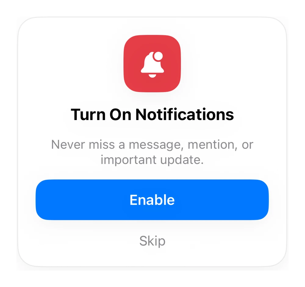
A notification-permission prompt.
Cards · SwiftUI · iOS 17
- cards
- swiftui
The actual source
NotifPermission.swift
// Notification Primer · syxUI · https://syxui.dev/components/sheet-notif-permission
// Free in any project. Keep this line and credit syxUI where a person can read it.

import SwiftUI

let shBlue = Color(red: 0.0, green: 0.47, blue: 1.0)
let shRed = Color(red: 0.90, green: 0.24, blue: 0.28)

func shCard<C: View>(_ w: CGFloat, radius: CGFloat = 18, @ViewBuilder _ c: () -> C) -> some View {
    c().frame(width: w).background(Color(.systemBackground), in: RoundedRectangle(cornerRadius: radius, style: .continuous)).overlay(RoundedRectangle(cornerRadius: radius, style: .continuous).stroke(Color.primary.opacity(0.07), lineWidth: 1)).shadow(color: .black.opacity(0.05), radius: 12, y: 5)
}

// Notification permission
struct NotifPermission: View {
    var body: some View {
        shCard(300, radius: 22) {
            VStack(spacing: 14) {
                Image(systemName: "bell.badge.fill").font(.system(size: 28)).foregroundStyle(.white).frame(width: 64, height: 64).background(shRed, in: RoundedRectangle(cornerRadius: 18, style: .continuous))
                Text("Turn On Notifications").font(.system(size: 18, weight: .bold))
                Text("Never miss a message, mention, or important update.").font(.system(size: 14)).foregroundStyle(.secondary).multilineTextAlignment(.center)
                Text("Enable").font(.system(size: 16, weight: .semibold)).foregroundStyle(.white).frame(maxWidth: .infinity).padding(.vertical, 13).background(shBlue, in: RoundedRectangle(cornerRadius: 14, style: .continuous))
                Text("Skip").font(.system(size: 15)).foregroundStyle(.secondary)
            }.padding(20)
        }
    }
}
iOS 17 · No dependencies
Dependencies
- SwiftUI
- No external dependencies
Requires iOS 17