Success Check
From syxUI — written for both platforms, not translated between them.
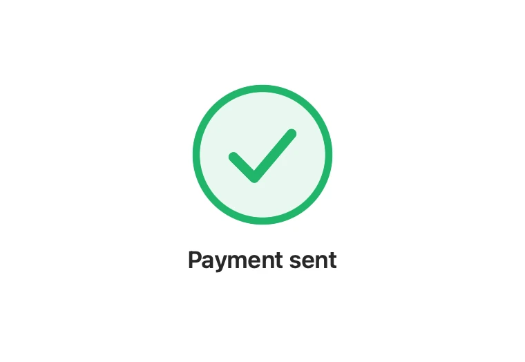
A confirmation mark that draws its ring and tick, then settles with a small overshoot.
Feedback · SwiftUI · Flutter · iOS 17 · Flutter 3.27
- feedback
- success
- checkmark
- confirmation
- animated
- payment
The actual source
SuccessCheck.swift
// Success Check · syxUI · https://syxui.dev/components/success-check
// Free in any project. Keep this line and credit syxUI where a person can read it.

import SwiftUI

/// A confirmation mark that draws itself: the ring sweeps, then the tick is
/// stroked on, then the whole thing settles with a small overshoot.
///
/// Built from two trimmed shapes rather than an image sequence, so it is sharp
/// at any size and recolours from one value.
struct SuccessCheck: View {
    var size: CGFloat = 96
    var tint: Color = Color(red: 0.13, green: 0.71, blue: 0.42)
    var title: String? = "Payment sent"
    var duration: Double = 1.0
    var onFinish: () -> Void = {}
    /// Drive the draw externally, 0...1.
    var progress: Double? = nil

    @Environment(\.accessibilityReduceMotion) private var reduceMotion
    @State private var animated: Double = 0

    private var t: Double { progress ?? animated }

    private var ring: Double { eased(t / 0.55) }
    private var tick: Double { eased((t - 0.35) / 0.45) }

    /// A brief overshoot as the tick lands, then back to rest.
    private var pop: Double {
        let local = min(max((t - 0.6) / 0.4, 0), 1)
        return sin(local * .pi) * 0.06
    }

    var body: some View {
        VStack(spacing: 18) {
            ZStack {
                Circle()
                    .fill(tint.opacity(0.10))

                Circle()
                    .trim(from: 0, to: ring)
                    .stroke(tint, style: StrokeStyle(lineWidth: size * 0.055, lineCap: .round))
                    .rotationEffect(.degrees(-90))

                Tick()
                    .trim(from: 0, to: tick)
                    .stroke(tint, style: StrokeStyle(lineWidth: size * 0.075,
                                                     lineCap: .round,
                                                     lineJoin: .round))
                    .padding(size * 0.28)
            }
            .frame(width: size, height: size)
            .scaleEffect(1 + pop)

            if let title {
                Text(title)
                    .font(.system(size: 17, weight: .semibold))
                    .opacity(eased((t - 0.55) / 0.4))
            }
        }
        .onAppear(perform: start)
        .accessibilityElement()
        .accessibilityLabel(title ?? "Done")
    }

    private func eased(_ raw: Double) -> Double {
        let c = min(max(raw, 0), 1)
        return 1 - pow(1 - c, 3)
    }

    private func start() {
        guard progress == nil else { return }
        guard !reduceMotion else { animated = 1; onFinish(); return }
        withAnimation(.linear(duration: duration)) { animated = 1 }
        DispatchQueue.main.asyncAfter(deadline: .now() + duration) { onFinish() }
    }
}

/// The tick, as a path so it can be trimmed and stroked on.
private struct Tick: Shape {
    func path(in rect: CGRect) -> Path {
        Path { path in
            path.move(to: CGPoint(x: rect.minX, y: rect.midY + rect.height * 0.04))
            path.addLine(to: CGPoint(x: rect.minX + rect.width * 0.36,
                                     y: rect.maxY - rect.height * 0.10))
            path.addLine(to: CGPoint(x: rect.maxX, y: rect.minY + rect.height * 0.14))
        }
    }
}

#Preview {
    SuccessCheck(progress: 1)
        .padding(40)
}
iOS 17 · No dependencies
SwiftUI note. Two trimmed shapes, no image sequence, so it stays sharp at any size. onFinish fires when the draw completes — use it to dismiss the sheet rather than a guessed delay.
Dependencies
- SwiftUI
- No external dependencies
- Flutter
- No external dependencies
Requires iOS 17
Requires Flutter 3.27