Toast
From syxUI — written for both platforms, not translated between them.
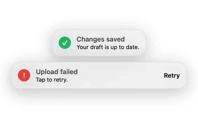
A floating status message with a tinted glyph and an optional action.
Feedback · SwiftUI · Flutter · iOS 17 · Flutter 3.27
- toast
- snackbar
- notification
- alert
- feedback
- banner
The actual source
Toast.swift
// Toast · syxUI · https://syxui.dev/components/toast
// Free in any project. Keep this line and credit syxUI where a person can read it.

import SwiftUI

/// A floating status toast with a leading glyph tinted by its kind.
///
/// The view is presentation-only: drive `isPresented` from your own state and
/// pair it with `.animation` at the call site. Keeping dismissal outside the
/// component means it composes with queues and undo actions.
struct Toast: View {
    enum Kind {
        case success, error, info

        var symbol: String {
            switch self {
            case .success: "checkmark"
            case .error: "exclamationmark"
            case .info: "info"
            }
        }

        var tint: Color {
            switch self {
            case .success: Color(red: 0.13, green: 0.71, blue: 0.40)
            case .error: Color(red: 0.90, green: 0.25, blue: 0.24)
            case .info: Color(red: 0.15, green: 0.44, blue: 0.95)
            }
        }
    }

    var kind: Kind = .success
    var title: String = "Changes saved"
    var message: String? = "Your draft is up to date."
    var actionTitle: String? = nil
    var onAction: () -> Void = {}

    var body: some View {
        HStack(spacing: 12) {
            Image(systemName: kind.symbol)
                .font(.system(size: 12, weight: .bold))
                .foregroundStyle(.white)
                .frame(width: 26, height: 26)
                .background(kind.tint, in: Circle())

            VStack(alignment: .leading, spacing: 1) {
                Text(title)
                    .font(.system(size: 14, weight: .semibold))
                if let message {
                    Text(message)
                        .font(.system(size: 12))
                        .foregroundStyle(.secondary)
                }
            }

            if let actionTitle {
                Spacer(minLength: 8)
                Button(actionTitle, action: onAction)
                    .font(.system(size: 13, weight: .semibold))
                    .foregroundStyle(.black)
                    .buttonStyle(.plain)
            }
        }
        .padding(.horizontal, 14)
        .padding(.vertical, 12)
        .background(.regularMaterial,
                    in: RoundedRectangle(cornerRadius: 18, style: .continuous))
        .overlay {
            RoundedRectangle(cornerRadius: 18, style: .continuous)
                .strokeBorder(Color(white: 0.88), lineWidth: 1)
        }
        .shadow(color: .black.opacity(0.12), radius: 20, y: 8)
        .accessibilityElement(children: .combine)
    }
}

#Preview {
    VStack(spacing: 12) {
        Toast()
        Toast(kind: .error, title: "Upload failed",
              message: "Tap to retry.", actionTitle: "Retry")
    }
    .padding(30)
}
iOS 17 · No dependencies
SwiftUI note. Present with .safeAreaInset(edge: .top) or an overlay, and animate with .transition(.move(edge: .top).combined(with: .opacity)).
Dependencies
- SwiftUI
- No external dependencies
- Flutter
- No external dependencies
Requires iOS 17
Requires Flutter 3.27