Weather Card
From syxUI — written for both platforms, not translated between them.
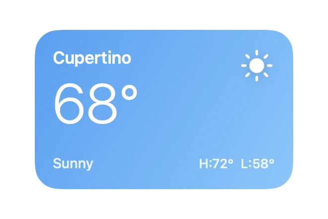
A glanceable conditions card that restyles itself from a single condition value.
Cards · SwiftUI · Flutter · iOS 17 · Flutter 3.27
- card
- weather
- widget
- gradient
- dashboard
The actual source
WeatherCard.swift
// Weather Card · syxUI · https://syxui.dev/components/weather-card
// Free in any project. Keep this line and credit syxUI where a person can read it.

import SwiftUI

/// A glanceable conditions card sized for a home screen or a dashboard row.
///
/// The gradient is derived from `condition`, so one value restyles the whole
/// card and you never hand-pick colours at the call site.
struct WeatherCard: View {
    enum Condition: String {
        case sunny = "Sunny"
        case cloudy = "Cloudy"
        case rain = "Rain"
        case night = "Clear"

        var symbol: String {
            switch self {
            case .sunny: "sun.max.fill"
            case .cloudy: "cloud.fill"
            case .rain: "cloud.rain.fill"
            case .night: "moon.stars.fill"
            }
        }

        var colors: [Color] {
            switch self {
            case .sunny: [Color(red: 0.36, green: 0.62, blue: 0.94),
                          Color(red: 0.55, green: 0.78, blue: 0.98)]
            case .cloudy: [Color(red: 0.47, green: 0.53, blue: 0.60),
                           Color(red: 0.66, green: 0.71, blue: 0.76)]
            case .rain: [Color(red: 0.27, green: 0.36, blue: 0.49),
                         Color(red: 0.42, green: 0.53, blue: 0.64)]
            case .night: [Color(red: 0.13, green: 0.16, blue: 0.33),
                          Color(red: 0.28, green: 0.31, blue: 0.52)]
            }
        }
    }

    var city: String = "Cupertino"
    var temperature: Int = 68
    var condition: Condition = .sunny
    var high: Int = 72
    var low: Int = 58

    var body: some View {
        VStack(alignment: .leading, spacing: 0) {
            Text(city)
                .font(.system(size: 17, weight: .semibold))

            Text("\(temperature)°")
                .font(.system(size: 56, weight: .light))
                .padding(.top, 2)

            Spacer(minLength: 8)

            HStack(alignment: .bottom) {
                Text(condition.rawValue)
                    .font(.system(size: 14, weight: .medium))
                    .foregroundStyle(.white.opacity(0.85))
                Spacer()
                Text("H:\(high)°  L:\(low)°")
                    .font(.system(size: 13, weight: .medium))
                    .foregroundStyle(.white.opacity(0.85))
            }
        }
        .foregroundStyle(.white)
        .padding(18)
        .frame(width: 260, height: 160, alignment: .topLeading)
        .background(
            LinearGradient(colors: condition.colors,
                           startPoint: .topLeading,
                           endPoint: .bottomTrailing),
            in: RoundedRectangle(cornerRadius: 24, style: .continuous)
        )
        .overlay(alignment: .topTrailing) {
            Image(systemName: condition.symbol)
                .font(.system(size: 30))
                .foregroundStyle(.white)
                .shadow(color: .black.opacity(0.15), radius: 6, y: 2)
                .padding(18)
        }
        .accessibilityElement(children: .combine)
        .accessibilityLabel("\(city), \(temperature) degrees, \(condition.rawValue)")
    }
}

#Preview {
    WeatherCard()
        .padding(30)
}
iOS 17 · No dependencies
SwiftUI note. Condition drives both the symbol and the gradient. Add a case and the card restyles with no changes at the call site.
Dependencies
- SwiftUI
- No external dependencies
- Flutter
- No external dependencies
Requires iOS 17
Requires Flutter 3.27