Count Widen
From syxUI — written for both platforms, not translated between them.
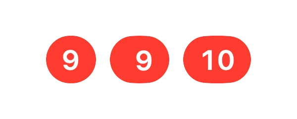
A count badge whose pill widens first, then lets the new digit column drop into the space.
Badges · SwiftUI · Flutter · iOS 17 · Flutter 3.27
- badge
- count
- notification
- digits
- width
- spring
- unread
The actual source
CountWidenBadge.swift
// Count Widen · syxUI · https://syxui.dev/components/count-widen-badge
// Free in any project. Keep this line and credit syxUI where a person can read it.

import SwiftUI

#if canImport(UIKit)
import UIKit
private typealias BadgeFont = UIFont
#else
import AppKit
private typealias BadgeFont = NSFont
#endif

/// Ten digits per wheel.
private let wheelDigits = 10

/// Cells in one strip: the ten digits, plus a repeat of `0` and `9` underneath
/// so a roll through 9 → 0 continues downward instead of jumping back to the
/// top of the strip.
private let stripCells = 12

/// A count badge whose pill opens before the arriving digit lands in it.
///
/// Two springs, deliberately out of step. The width leads on
/// `spring(response: 0.34, dampingFraction: 0.78)`, so the pill makes room
/// first; `widthLead` milliseconds later the digit strips fall by one row on
/// `spring(duration: 0.42, bounce: digitBounce)`, which kicks about 7% past and
/// returns. Width first reads as the badge making space — a width that snaps
/// while the digit springs reads as broken, and one curve driving the width
/// beside a spring driving the digit reads as unwell.
///
/// The strips are real: a `VStack` of digit cells clipped to one row, so *when*
/// a column arrives is a number this component owns.
/// `.contentTransition(.numericText)` cross-fades a formatted string and would
/// hand that timing to the framework.
struct CountWidenBadge: View {
    var count: Int = 9
    var height: CGFloat = 20
    /// How far the width leads the digit, in milliseconds. This is the effect.
    var widthLead: Double = 70
    /// Overshoot on the digit spring. 0 lands flat; 0.38 kicks past and back.
    var digitBounce: Double = 0.38
    var fill: Color = Color(red: 1.0, green: 0.231, blue: 0.188)
    var text: Color = Color(white: 1.0)

    /// Preview override. When set, the badge renders one increment
    /// (`count` → `count + 1`) at that point of the drive instead of answering
    /// taps. 0 is before, 1 is settled.
    var progress: Double? = nil

    // Chosen, not exposed. A pill that wobbles wider than its neighbour reads
    // as a wobble rather than as a spring, so the width is damped to within a
    // couple of percent — and the *lead* is the number worth a slider.
    private let widthResponse: Double = 0.34
    private let widthDamping: Double = 0.78
    private let digitDuration: Double = 0.42
    private let plusFade: Double = 0.14

    /// Seconds of simulated time one increment spans. Both springs are inside
    /// half a percent of their target by here, so `progress: 1` is settled.
    private let driveSpan: Double = 0.70

    @Environment(\.accessibilityReduceMotion) private var reduceMotion

    /// Taps accumulate here rather than overwriting `count`, so the badge still
    /// retargets when `count` changes underneath it.
    @State private var bumps: Int = 0
    @State private var rolled: Double? = nil
    @State private var opened: CGFloat? = nil
    @State private var plusShown: Double? = nil
    @State private var measuredDigit: CGFloat? = nil
    @State private var measuredPlus: CGFloat? = nil

    var body: some View {
        let scrubbed = scrubbedFrame
        let width = scrubbed?.width ?? opened ?? pillWidth(for: target)
        let roll = scrubbed?.roll ?? rolled ?? capped(target)
        let plusAmount = scrubbed?.plus ?? plusShown ?? plus(target)

        // Everything hangs off the pill's trailing inner edge, so the slack the
        // leading width spring opens shows up on the *leading* side — which is
        // exactly where the next column lands.
        let digitsRight = width - sidePadding - plusWidth * plusAmount

        ZStack(alignment: .leading) {
            Capsule(style: .continuous).fill(fill)

            wheel(place: 0, roll: roll)
                .offset(x: digitsRight - digitWidth)
            wheel(place: 1, roll: roll)
                .offset(x: digitsRight - digitWidth * 2)

            // Past the cap the third column never comes; the strips hold at 99
            // and this fades in while the width opens one glyph for it.
            glyph("+")
                .frame(width: plusWidth, height: rowHeight)
                .opacity(plusAmount)
                .offset(x: digitsRight)
        }
        .frame(width: width, height: height)
        .clipShape(Capsule(style: .continuous))
        .contentShape(Capsule(style: .continuous))
        .background(alignment: .topLeading) { ruler }
        .onPreferenceChange(DigitAdvanceKey.self) { value in
            if value > 0 { measuredDigit = value }
        }
        .onPreferenceChange(PlusAdvanceKey.self) { value in
            if value > 0 { measuredPlus = value }
        }
        .onAppear(perform: pin)
        .onTapGesture { step(by: 1) }
        .onLongPressGesture(minimumDuration: 0.4) { step(by: -1) }
        .onChange(of: target, initial: false) { _, value in settle(on: value) }
        .onChange(of: digitWidth, initial: false) { _, _ in
            // Type changed size under us; the spring's stored end point is now
            // a stale number of points.
            if opened != nil { opened = pillWidth(for: target) }
        }
        .sensoryFeedback(.increase, trigger: target)
        .sensoryFeedback(.impact(weight: .light), trigger: columnCount)
        .accessibilityElement()
        .accessibilityLabel(Text("\(target) unread"))
    }

    // MARK: - Drive

    /// The whole visual state at one instant of `progress`.
    ///
    /// `Spring` evaluates the same maths `.spring(…)` runs, so a scrubbed frame
    /// and a live frame are the same frame — the preview is not an impression
    /// of the animation, it is the animation.
    private var scrubbedFrame: (width: CGFloat, roll: Double, plus: Double)? {
        guard let progress else { return nil }

        let time = min(max(progress, 0), 1) * driveSpan
        let lead = max(0, widthLead) / 1000
        let from = target
        let to = min(999, target + 1)

        let widthPart = Spring(response: widthResponse, dampingRatio: widthDamping)
            .value(target: 1.0, time: time)
        let digitPart = Spring(duration: digitDuration, bounce: bounce)
            .value(target: 1.0, time: max(0, time - lead))
        let fade = min(1, max(0, (time - lead) / plusFade))

        return (
            width: pillWidth(for: from)
                + (pillWidth(for: to) - pillWidth(for: from)) * widthPart,
            roll: capped(from) + (capped(to) - capped(from)) * digitPart,
            plus: plus(from) + (plus(to) - plus(from)) * (fade * fade * (3 - 2 * fade))
        )
    }

    /// Where the springs start.
    ///
    /// Without this the first change would land instantly rather than
    /// animating: the fallbacks in `body` already read the *new* count, so
    /// there would be nothing left between the two frames.
    private func pin() {
        guard progress == nil, opened == nil else { return }
        opened = pillWidth(for: target)
        rolled = capped(target)
        plusShown = plus(target)
    }

    /// Width first, digit `widthLead` later.
    ///
    /// A second tap mid-flight retargets both springs rather than queueing:
    /// each keeps its velocity and re-aims, so a rapid climb is one continuous
    /// motion rather than a queue of pops.
    private func settle(on value: Int) {
        guard progress == nil else { return }

        let width = pillWidth(for: value)
        let roll = capped(value)
        let plusAmount = plus(value)

        guard !reduceMotion else {
            opened = width
            rolled = roll
            plusShown = plusAmount
            return
        }

        let lead = max(0, widthLead) / 1000
        withAnimation(.spring(response: widthResponse, dampingFraction: widthDamping)) {
            opened = width
        }
        withAnimation(.spring(duration: digitDuration, bounce: bounce).delay(lead)) {
            rolled = roll
        }
        withAnimation(.easeInOut(duration: plusFade).delay(lead)) {
            plusShown = plusAmount
        }
    }

    /// Increment on tap, decrement on long press, so the badge demonstrates
    /// itself. Both fire on the gesture's end, so a cancelled press does
    /// nothing, and the clamp keeps `bumps` from drifting past the ends.
    private func step(by delta: Int) {
        bumps = min(max(count + bumps + delta, 0), 999) - count
    }

    // MARK: - Digits

    /// One digit strip.
    ///
    /// Cells run top to bottom in *descending* order, so an increment slides
    /// the strip downward and the arriving digit enters from above — it drops
    /// into the space the width just made. Every column moves the same way, so
    /// the whole number reads as one wheel rather than two.
    private func wheel(place: Int, roll: Double) -> some View {
        let value = wheelValue(place: place, roll: roll)
            .truncatingRemainder(dividingBy: Double(wheelDigits))
        let row = Double(wheelDigits) - value

        return VStack(spacing: 0) {
            ForEach(0..<stripCells, id: \.self) { cell in
                glyph(face(cell: cell, place: place))
                    .frame(width: digitWidth, height: rowHeight)
            }
        }
        .offset(y: -row * rowHeight)
        .frame(width: digitWidth, height: rowHeight, alignment: .top)
        .clipped()
        .mask(alignment: .top) { aperture }
    }

    /// The window's edges, softened.
    ///
    /// A hard clip puts a cut line in mid-air a few points inside the pill, and
    /// mid-roll you see a glyph sliced by nothing. The band is 16% of the row
    /// at each end — outside the resting glyph's own box, so a settled digit is
    /// untouched and only a moving one fades as it leaves.
    private var aperture: some View {
        LinearGradient(
            stops: [
                .init(color: .white.opacity(0), location: 0),
                .init(color: .white, location: 0.16),
                .init(color: .white, location: 0.84),
                .init(color: .white.opacity(0), location: 1)
            ],
            startPoint: .top,
            endPoint: .bottom
        )
        .frame(height: rowHeight)
    }

    /// A geared odometer: the tens wheel only turns while the ones wheel is
    /// crossing its own 9 → 0. Without the gearing a count of 9 would sit its
    /// tens wheel nine tenths of the way round, and the badge would read "09".
    private func wheelValue(place: Int, roll: Double) -> Double {
        let scale = pow(10, Double(place))
        let turns = (roll / scale).rounded(.down)
        let within = roll - turns * scale
        return turns + min(1, max(0, within - (scale - 1)))
    }

    private func face(cell: Int, place: Int) -> String {
        let digit = ((wheelDigits - cell) % wheelDigits + wheelDigits) % wheelDigits
        // A leading zero is not drawn, which is what makes a single-digit count
        // a circle instead of "09" — and what the tens column falls out of.
        if digit == 0 && place > 0 { return "" }
        return String(digit)
    }

    private func glyph(_ string: String) -> some View {
        Text(string)
            .font(.system(size: fontSize, weight: .semibold))
            .monospacedDigit()
            .foregroundStyle(text)
    }

    // MARK: - Geometry

    /// Derived, not exposed: a badge whose text sizes independently of its box
    /// stops being a badge at the first setting a reader tries.
    private var fontSize: CGFloat { height * 0.58 }
    private var sidePadding: CGFloat { height * 0.34 }
    private var bounce: Double { min(max(digitBounce, 0), 0.9) }

    /// `NSFont` has no `lineHeight`, so both platforms build the row pitch from
    /// the three metrics that make one.
    private var rowHeight: CGFloat {
        let font = platformFont
        return font.ascender - font.descender + font.leading
    }

    /// Measured, never guessed. Tabular figures give every digit one advance,
    /// so any label's width is a count of them — and a ratio of the point size
    /// would break the moment the type scales.
    private var digitWidth: CGFloat { measuredDigit ?? advance(of: "0") }
    private var plusWidth: CGFloat { measuredPlus ?? advance(of: "+") }

    private var platformFont: BadgeFont {
        .monospacedDigitSystemFont(ofSize: fontSize, weight: .semibold)
    }

    /// Frame-one seed only. The hidden `Text` pair below is the authority,
    /// because it is measured in the environment the badge actually draws in.
    private func advance(of string: String) -> CGFloat {
        (string as NSString).size(withAttributes: [.font: platformFont]).width
    }

    private var target: Int { max(0, min(999, count + bumps)) }
    private var columnCount: Int { digitCount(target) + (target > 99 ? 1 : 0) }

    private func digitCount(_ value: Int) -> Int { value > 9 ? 2 : 1 }
    private func capped(_ value: Int) -> Double { Double(min(value, 99)) }
    private func plus(_ value: Int) -> Double { value > 99 ? 1 : 0 }

    private func pillWidth(for value: Int) -> CGFloat {
        let content = digitWidth * CGFloat(digitCount(value))
            + plusWidth * CGFloat(plus(value))
        return max(height, content + sidePadding * 2)
    }

    /// Two hidden glyphs, measured where they will be drawn.
    private var ruler: some View {
        HStack(spacing: 0) {
            Text("0").background { report(DigitAdvanceKey.self) }
            Text("+").background { report(PlusAdvanceKey.self) }
        }
        .font(.system(size: fontSize, weight: .semibold))
        .monospacedDigit()
        .fixedSize()
        .hidden()
    }

    private func report<K: PreferenceKey>(_ key: K.Type) -> some View
    where K.Value == CGFloat {
        GeometryReader { geometry in
            Color.clear.preference(key: key, value: geometry.size.width)
        }
    }
}

private struct DigitAdvanceKey: PreferenceKey {
    static let defaultValue: CGFloat = 0
    static func reduce(value: inout CGFloat, nextValue: () -> CGFloat) {
        value = max(value, nextValue())
    }
}

private struct PlusAdvanceKey: PreferenceKey {
    static let defaultValue: CGFloat = 0
    static func reduce(value: inout CGFloat, nextValue: () -> CGFloat) {
        value = max(value, nextValue())
    }
}

#Preview {
    // The first is live — tap it to increment, long-press to go back.
    HStack(spacing: 14) {
        CountWidenBadge(count: 9, height: 48)
        CountWidenBadge(count: 9, height: 48, progress: 0.12)
        CountWidenBadge(count: 9, height: 48, progress: 1)
        CountWidenBadge(count: 120, height: 48)
    }
    .padding(22)
}
iOS 17 · No dependencies
SwiftUI note. The animated width sits on the badge's own frame, so drop it straight into the row: the enclosing HStack re-lays-out every frame and the neighbour slides on the same spring. The tap is a self-demo — inside a row that is already a button, add .accessibilityHidden(true) and let the row speak the count.
Dependencies
- SwiftUI
- No external dependencies
- Flutter
- No external dependencies
Requires iOS 17
Requires Flutter 3.27